In this project, you'll create a 'Pinboard': a web application to save, categorise and collect images from across the internet. Users will be able to:
- Add new images to the board.
- Assign specific tags to these images.
- Filter the board to show only images matching a specific tag.

You can take a look at the final code that we will have at the end of this project by going to https://repl.it/@ritza/Pinboard-Project. In addition, you can view it as a standalone page by pressing the Open in a new tab button (at the top right of the repl) or by going straight to the following URL: https://pinboard-project.ritza.repl.co
We'll walk through the creation of the final pinboard in two parts.
- In part 1 (this article), we'll set up the HTML and CSS of our pinboard.
- In part 2, we'll add the functionality using JavaScript.
In part 1, we'll work through
Creating Your Own Project on Repl.it
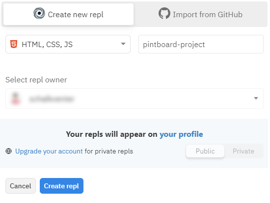
If you haven't already, head to the signup page and create a Repl.it account. Once created, set up a new project by:
- Clicking on the
+ New replbutton. - Choosing the "HTML, CSS, JS" language.
- Giving your repl a name: In our case "pinboard-project".
- Clicking the
Create replbutton.
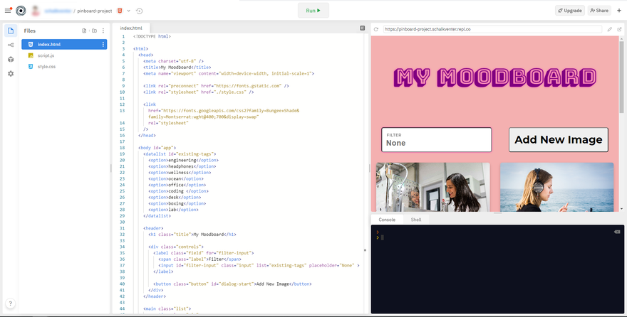
Because we selected "HTML, CSS, JS" as our repl language, Repl.it has created the basic files needed for our front-end project, which should be:
index.htmlstyle.cssscript.js
Basic Structure and Styling
We'll start off with a basic skeleton with some hard-coded examples in it. First, we need to open our style.css file and add the following styling to it. If you are unsure what it does, don't worry – we'll discuss it in depth later.
* {
  box-sizing: border-box;
}

body {
  padding: 0;
  margin: 0;
  background-color: #f4b0b0;
  font-family: "Helvetica neue", Helvetica, Arial, sans-serif;
  overflow-y: scroll;
  overflow-x: hidden;
}

.title {
  font-size: 4rem;
  text-align: center;
  font-family: "Bungee Shade", cursive;
  color: purple;
  display: none;
}

@media (min-width: 40rem) {
  .title {
    display: block;
  }
}

.field {
  display: flex;
  justify-content: center;
  align-items: center;
  font-size: 1.5rem;
  font-weight: bold;
  letter-spacing: 0.5px;
  position: relative;
  cursor: pointer;
  max-width: 40rem;
}

.label {
  position: absolute;
  font-size: 0.75rem;
  left: 1rem;
  top: 1rem;
  opacity: 0.5;
  text-transform: uppercase;
  font-weight: bold;
}

.input {
  border-radius: 6px;
  font-weight: bold;
  padding: 2rem 0.75rem 0.75rem;
  width: 100%;
  font-size: 1.5rem;
  box-shadow: 0 0 5px #fc47bb;
}

.controls {
  display: flex;
  justify-content: space-between;
  padding: 2rem;
  flex-wrap: wrap;
}

.button {
  border-radius: 6px;
  padding: 1rem;
  font-size: 2rem;
  font-family: "Montserrat", sans-serif;
  font-weight: bold;
  white-space: nowrap;
  cursor: pointer;
  margin: 0.5rem 0;
}

.button:disabled {
  cursor: not-allowed;
}

.button:not(:disabled):hover {
  background: #CCC;
}

.list {
  margin: -1rem;
  display: flex;
  flex-wrap: wrap;
  padding: 0 1rem 4rem;
}

.pin {
  position: relative;
  padding: 1rem;
    width: 100%;
}

@media (min-width: 40rem) {
  .pin {
    width: 50%;
  }
}

@media (min-width: 65rem) {
  .pin {
    width: 33.333333333333%;
  }
}

@media (min-width: 100rem) {
  .pin {
    width: 25%;
  }
}

.info {
  position: absolute;
  bottom: 0;
  left: 0;
  width: 100%;
  opacity: 0;
  transition: opacity 0.3s, transform 0.3s;
  list-style: none;
  padding: 0;
  display: flex;
  justify-content: center;
  flex-wrap: wrap;
  transform: translateY(1rem);
}

.pin:hover .info {
  opacity: 1;
  transform: translateY(-1rem);
}

.remove {
  position: absolute;
  right: 2rem;
  top: 2rem;
  border-radius: 50%;
  display: flex;
  align-items: center;
  justify-content: center;
  height: 2.5rem;
  width: 2.5rem;
  font-size: 1.5rem;
  font-weight: bold;
  font-family: "Montserrat", sans-serif;
  cursor: pointer;
  opacity: 0;
  transition: opacity 0.3s, transform 0.3s;
  transform: translateY(-1rem);
}

.pin:hover .remove {
  transform: translateY(0);
  opacity: 1;
}

.remove:hover {
  background: #CCC;
}

.image {
  width: 100%;
  height: 20rem;
  object-fit: cover;
  box-shadow: 0 4px 8px 0 rgba(0, 0, 0, 0.2);
  border-radius: 6px;
  background-color: #d18c8c;
}

.tag {
  margin: 0.5rem;
  border-radius: 15px;
  padding: 1rem;
  font-size: 1rem;
  font-family: "Montserrat", sans-serif;
  font-weight: bold;
  cursor: pointer;
  text-transform: capitalize;
}

.tag:hover {
  background: #CCC;
}

.overlay {
  position: fixed;
  background: rgba(0, 0, 0, 0.7);
  top: 0;
  left: 0;
  height: 100%;
  width: 100%;
  display: flex;
  align-items: center;
  justify-content: center;
  box-shadow:
    0px 11px 15px -7px rgba(0,0,0,0.2),
    0px 24px 38px 3px rgba(0,0,0,0.14),
    0px 9px 46px 8px rgba(0,0,0,0.12);
}

.form {
  background: white;
  width: 100%;
  max-width: 40rem;
  border-radius: 16px;
}

.dialog-list {
  list-style: none;
  padding: 1rem;
}

.dialog-item {
  padding: 1rem;
  text-align: center;
}

.helper {
  display: block;
  padding: 0.75rem 0;
  opacity: 0.6;
}

.hidden {
  display: none;
}
After adding the above code to style.css, open your index.html file and replace all of the existing code with the following snippet.
<!DOCTYPE html>
<html>
<head>
  <meta charset="utf-8" />
  <title>My Moodboard</title>
  <meta name="viewport" content="width=device-width, initial-scale=1.0">

  <link rel="stylesheet" href="./style.css" />
  <script src="./script.js" defer></script>

  <link rel="preconnect" href="https://fonts.gstatic.com" />

  <link
    href="https://fonts.googleapis.com/css2?family=Bungee+Shade&family=Montserrat:wght@400;700&display=swap"
    rel="stylesheet"
  />
</head>
<body id="app">
<datalist id="existing-tags">
<option>Engineering</option>
<option>Headphones</option>
<option>Wellness</option>
<option>Ocean</option>
<option>Office</option>
<option>Coding</option>
<option>Desk</option>
<option>Boxing</option>
<option>Lab</option>
</datalist>
<header>
<h1 class="title">My Moodboard</h1>
<div class="controls">
<label class="field" for="filter-input">
<span class="label">Filter</span>
<input
type="search"
id="filter-input"
class="input"
list="existing-tags"
placeholder="None"
/>
</label>
<button class="button" id="dialog-start">Add New Image</button>
</div>
</header>
<main>
<div class="list" id="pins-list">
<section class="pin">
<img
class="image"
src="https://images.unsplash.com/photo-1580983218765-f663bec07b37?w=600"
/>
<ul class="info">
<li class="tag-wrap">
<button class="tag">engineering</button>
</li>
</ul>
<button
class="remove"
aria-label="remove"
value="122203215486581930752615279550"
>
✕
</button>
</section>
<section class="pin">
<img
class="image"
src="https://images.unsplash.com/photo-1572932491814-4833690788ad?w=600"
/>
<ul class="info">
<li class="tag-wrap">
<button class="tag">headphones</button>
</li>
<li class="tag-wrap">
<button class="tag">ocean</button>
</li>
<li class="tag-wrap">
<button class="tag">wellness</button>
</li>
</ul>
<button
class="remove"
aria-label="remove"
value="144685389103194178251333634000"
>
✕
</button>
</section>
<section class="pin">
<img
class="image"
src="https://images.unsplash.com/photo-1580894908361-967195033215?w=600"
/>
<ul class="info">
<li class="tag-wrap">
<button class="tag">office</button>
</li>
<li class="tag-wrap">
<button class="tag">coding</button>
</li>
<li class="tag-wrap">
<button class="tag">desk</button>
</li>
</ul>
<button
class="remove"
aria-label="remove"
value="159279541173033634211014623228"
>
✕
</button>
</section>
<section class="pin">
<img
class="image"
src="https://images.unsplash.com/photo-1584464491033-06628f3a6b7b?w=600"
/>
<ul class="info">
<li class="tag-wrap">
<button class="tag">boxing</button>
</li>
<li class="tag-wrap">
<button class="tag">wellness</button>
</li>
</ul>
<button
class="remove"
aria-label="remove"
value="75261220651273643680893699100"
>
✕
</button>
</section>
<section class="pin">
<img
class="image"
src="https://images.unsplash.com/photo-1581094271901-8022df4466f9?w=600"
/>
<ul class="info">
<li class="tag-wrap">
<button class="tag">lab</button>
</li>
<li class="tag-wrap">
<button class="tag">engineering</button>
</li>
</ul>
<button
class="remove"
aria-label="remove"
value="161051747537834597427464147310"
>
✕
</button>
</section>
</div>
</main>
<dialog id="dialog" class="overlay hidden">
<form id="dialog-form" class="form">
<div class="dialog-item">
<label class="field" for="dialog-image">
<span class="label">Image URL</span>
<input class="input" type="url" id="dialog-image" />
</label>
<em class="helper">For example: https://images.unsplash.com/photo-1584464491033-06628f3a6b7b</em>
</div>
<div class="dialog-item">
<label class="field" for="dialog-tags">
<span class="label">Tags</span>
<input class="input" type="text" id="dialog-tags" />
</label>
<em class="helper">Separate multiple tags with commas. For example: engineering, coding</em>
</div>
<div class="dialog-item">
<button type="submit" class="button" id="dialog-submit" disabled>
Save Image
</button>
</div>
</form>
</dialog>
</body>
</html>
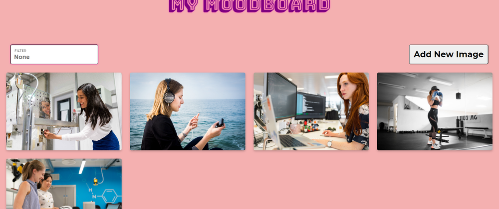
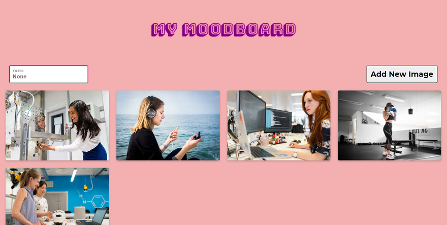
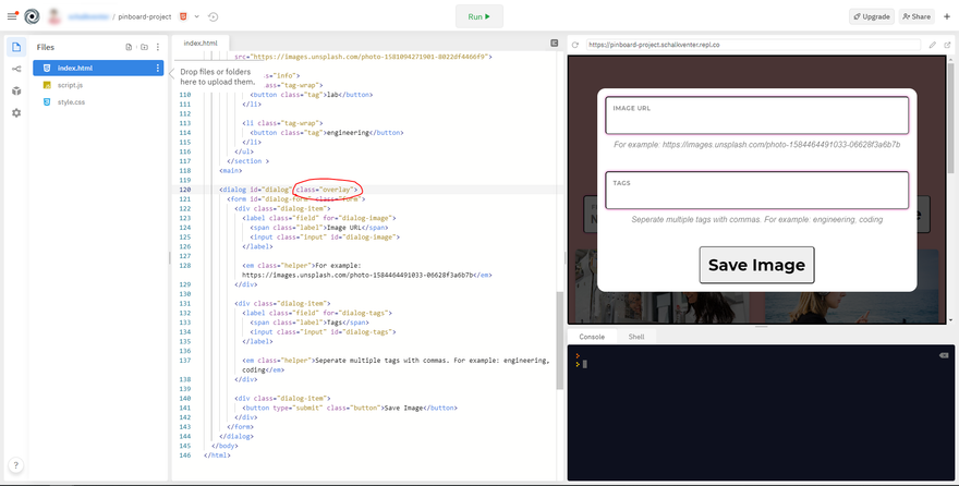
Yikes! That is quite a lot of HTML and CSS. Regardless, if you run your repl (with the big Run button at the top) you should see your project spring to life, as shown below.
You can click the Open in new tab button at the far top right to open your project in a separate browser tab as follows:
Markup
Let's walk through the above code step by step, starting with the HTML.
Head
Our HTML starts off with a <!DOCTYPE html> and a <html> element. These signal to the browser that we are using modern HTML.
Inside the <html> element, we see another element titled <head>. This element is used to communicate meta information to the browser. The elements inside it won't be shown to the user but provide the browser with useful commands to run before the user-facing HTML content is created. Our <head> element has the following nested elements:
<head>
<meta charset="utf-8" />
<title>My Moodboard</title>
<meta name="viewport" content="width=device-width, initial-scale=1.0">
<link rel="stylesheet" href="./style.css" />
<script src="./script.js" defer></script>
<link rel="preconnect" href="https://fonts.gstatic.com" />
<link
href="https://fonts.googleapis.com/css2?family=Bungee+Shade&family=Montserrat:wght@400;700&display=swap"
rel="stylesheet"
/>
</head>
- The first
<meta>element determines the character types that should be used by the browser. This is required in all HTML documents, and is almost always set to "utf-8". - The
<title>element determines the name that is shown on in a user's browser tab. It is also used by search engines and accessibility devices as the name of the page. - The second
<meta>element tells the browser to not automatically scale the size of our content. This is required for styling to look the same across several screen sizes such as a desktop computer and mobile phone (called responsive web design). - The first
<link>element loads our CSS file (style.css) which we populated above. - The
<script>element loads the (still empty) JavaScript file (script.js). In addition, thedeferattribute tells the browser to only execute our JavaScript once all HTML has been created. Otherwise, the HTML tags that we look for in our JavaScript will not exist yet (since the<script>element is created before our HTML content, inside the<body>element). - The remaining
<link>elements are specific code that we receive when selecting fonts to use from the Google Fonts website. These are copied and pasted from the Google Fonts website, and allow us to use the fonts in question.
Datalist
Next is our <body> element. The <body> element contains the actual HTML that should be shown to a user. The first element in our body is a <datalist> element. The <datalist> element will not be displayed to users but will be used by <input> elements within our HTML to recommend existing tag values as users type. Note that despite the <datalist> not rendering anything to users, it is required to be in the <body> element and not the <head> element.
<datalist id="existing-tags">
  <option>Engineering</option>
  <option>Headphones</option>
  <option>Wellness</option>
  <option>Ocean</option>
  <option>Office</option>
  <option>Coding </option>
  <option>Desk</option>
  <option>Boxing</option>
  <option>Lab</option>
</datalist>
Header
Next is the <header> element (note that this is different from <head>). The <header> element groups content (shown to the user) at the top of the page. Inside our <header> element we have the following:
<header>
  <h1 class="title">My Moodboard</h1>

  <div class="controls">
    <label class="field" for="filter-input">
      <span class="label">Filter</span>
      <input type="search" id="filter-input" class="input" list="existing-tags" placeholder="None" >
    </label>

    <button class="button" id="dialog-start">Add New Image</button>
  </div>
</header>
- An
<h1>element that serves as the title of our page. The<h1>element will be used by search engines and accessibility devices to determine what page a user is currently on. Given that we only have one page, this can be the same as our<title>(defined in the above section). - By default,
<div>elements do not have any inherent meaning and are often used to group and position content. The<div>element that we are using here is meant to wrap and style both the filter field and "Add New Image" button. ThecontrolsCSSclassattribute is used to add styling that aligns the filter and button side by side. - The
<label>element wraps the entire filter field and tells search engines and accessibility devices that the tags inside are grouped together. ThefieldCSSclassis used to style the field itself, whereas theforattribute points to theidattribute of theinputelement that is used by this<label>element. - By default
<span>elements indicate a piece of short text used on our page. In our case, it adds a description in the top of the field. We are using thelabelCSSclassattribute to add the styling required to overlay the<span>element on top of the<input>element. - The
<input>element has atypeattribute that is set tosearch. This tells the browser to make use of a special search input (this has several enhancements, such as a button to clear the current search phrase). Furthermore, we have the standardidattribute andclassattributes. Lastly, we add theidvalue of ourdatalist(from the previous code snippet) to thelistattribute (this links this input to ourdatalist). Finally, we add aplaceholderattribute that tells the browser to display "None" when theinputis empty. - Lastly, similar to the above, our button has a
classattribute for CSS styling and anidattribute to be used by our JavaScript.
Sections
Next, we have a <main> element (signifying the main content of our <body> element). Inside the <main> element we have a <div> with several <section> elements inside it. Each <section> element displays an image (and associated controls) pinned by the user. Let's take a look at a single pinned image:
<section class="pin">
<img
class="image"
src="https://images.unsplash.com/photo-1580894908361-967195033215?w=600"
/>
<ul class="info">
<li class="tag-wrap">
<button class="tag">office</button>
</li>
<li class="tag-wrap">
<button class="tag">coding</button>
</li>
<li class="tag-wrap">
<button class="tag">desk</button>
</li>
</ul>
<button
class="remove"
aria-label="remove"
value="159279541173033634211014623228"
>
✕
</button>
</section>
- The wrapping
<section>element indicates to search engines and accessibility devices that the content inside should be treated as a grouped, standalone piece of information. - The
<img>element is used to show the pinned image (by supplying the URL). Note that the behaviour of this image is a bit different from regular<img>element behaviour. By means of the CSS styling applied to it, the relevant image will scale up or down until it covers the entire<section>element. - The
<ul>element is used to indicate to search engines and accessibility devices that the content that follows is part of a list. When using an<ul>element, the order of the items doesn't matter, whereas if you use an<ol>element, it does. - Each
<li>inside the<ul>element indicates a separate item inside the list. - Inside each
<li>is a<button>element that can be pressed to show all pins that have the same tag. - The last
<button>element creates a way for users to remove an image from the pinboard. We are using the multiplication sign (×) as the text label of the button. It can be added to HTML by using the following special HTML entity code:✕. While this visually appears similar to a crossed-out icon, usually associated with removing something, semantically it will be read differently by search engines and accessibility devices. It will be read as a multiplication sign, which as you can probably understand will create a lot of confusion. Therefore, we use thearia-labelattribute to override the semantic value associated with the button to "remove". Lastly, you will see that the<button>element also has avalueattribute with a unique number. The reason for this will be explained in part 2 of this project, so don't worry about it too much for now.
Dialog
Lastly, is a <dialog> element. While the <dialog> element is currently hidden from users with a hidden CSS class, it will be shown once the hidden class is removed. When it is visible, users can use it to add a new image to the board. The <dialog> element consists of the following:
<dialog id="dialog" class="overlay hidden">
  <form id="dialog-form" class="form">
    <div class="dialog-item">
      <label class="field" for="dialog-image">
        <span class="label">Image URL</span>
        <input class="input" type="url" id="dialog-image" />
      </label>

      <em class="helper">For example: https://images.unsplash.com/photo-1584464491033-06628f3a6b7b</em>
    </div>

    <div class="dialog-item">
      <label class="field" for="dialog-tags">
        <span class="label">Tags</span>
        <input class="input" type="text" id="dialog-tags" />
      </label>

      <em class="helper">Separate multiple tags with commas. For example: engineering, coding</em>
    </div>

    <div class="dialog-item">
      <button type="submit" class="button" id="dialog-submit" disabled>
        Save Image
      </button>
    </div>
  </form>
</dialog>
- The wrapping
<dialog>element forms the transparent black overlay that sits behind the<form>element. It has both anoverlayCSS class (for this behaviour) and a dynamichiddenCSS class that can be toggled on and off in order to show or hide the dialog (and nested elements). - The
<form>element indicates to search engines and accessibility devices that the next section functions as a traditional web form that should be submitted by clicking a button (as opposed to our filtering which happens in real time as you type). Note that a<form>element can also be submitted with the "Enter" key once the required data has been provided. - Within the
<form>element are three repeating<div>elements. As mentioned before, these have no semantic meaning, but can be used to group and position elements. In this case, we are using the<div>elements to add some spacing between the different elements in the form (by means of thedialog-itemCSS class). - Inside the first two
<div>tags, we are reusing the first input field HTML structure we created (from the above<header>snippet), albeit with differentidandtypeattributes on each<input>element. - We are also adding
<em>elements after each. The<em>element is short for "emphasis" and is similar in function to<span>; however, it indicates that the piece of text has specific importance. In our snippet above, we use this element for helper text to provide users with context regarding what is expected in the fields.
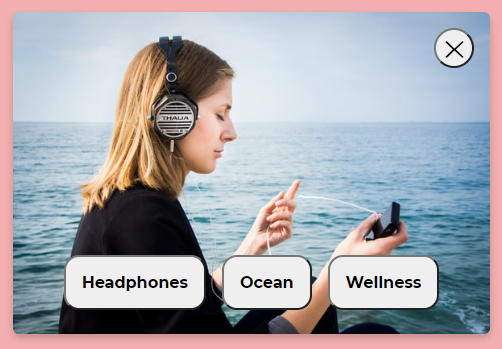
When unhidden, the dialog will look as follows:
Styling
Now that we've covered the basic HTML structure, let's dive into our CSS (style.css). We won't cover each part of this in detail, but you can use the phenomenal CSS-Tricks maintained Almanac to understand exactly what specific properties do. Let's take a look at some broader aspects of CSS that we have used in this file.
Universal selector
The * selector is named the universal CSS selector. It applies the designated styling rules to every single HTML element on the page. In our case, we want to override the way that size is calculated on our page. By default, all elements have a box-sizing of content-box; however, we want to override the default behaviour for all tags to border-box. This snippet of CSS is so common in modern-day web development that the 1st of February is actually designated annual International Box-sizing Awareness Day by the front-end community.
* {
  box-sizing: border-box;
}
By default, content-box adds all borders and padding on top of the designated size of an element. For example, if we have an element that has a width: 10rem with padding: 1rem and border: 1px, the actual size of the element will be the total value of 10rem + 1rem + 1px.
By using border-box, all of these are included as part of an element's designated width. For example, instead of the total width being 10rem + 1rem + 1px, it will be the specified 10rem with the space needed for padding and borders being factored into this amount.
Scrolling
You will notice that we set a couple of rules in order to override the default (often different) values of the <body> element in different browsers.
body {
  padding: 0;
  margin: 0;
  background-color: #f4b0b0;
  font-family: "Helvetica neue", Helvetica, Arial, sans-serif;
  overflow-y: scroll;
  overflow-x: hidden;
}
Specifically, you'll see that we set overflow-x: hidden and overflow-y: scroll. This is done to prevent users from accidentally scrolling horizontally, and it also forces a vertical scroll bar (even if the content does not exceed the height of your window). The latter is to ensure that the content doesn't jump around when a vertical scroll bar automatically gets added (or removed).
Positioning
Next, you'll notice that we are using position: relative and position: absolute in our field and label CSS classes. This allows us to overlay the field label on top of the input (overlaying it). The position: absolute rule tells the element to exit the regular content flow and instead resort to being manually placed by the CSS (by means of top and left). Meanwhile, position: relative tells the absolute positioned content what it should use as a reference. This means that our label will be set 1rem from the top and bottom of the parent field. Furthermore, flex, justify-content and align-items are used to position elements using the regular content flow inside an element. If you want to learn more about these properties you can have a look at Chris Coyier's super useful A Complete Guide to Flexbox.
.field {
  display: flex;
  justify-content: center;
  align-items: center;
  font-size: 1.5rem;
  font-weight: bold;
  letter-spacing: 0.5px;
  position: relative;
  cursor: pointer;
  max-width: 40rem;
}

.label {
  position: absolute;
  font-size: 0.75rem;
  left: 1rem;
  top: 1rem;
  opacity: 0.5;
  text-transform: uppercase;
  font-weight: bold;
}
Pseudo-classes
You will notice that there is an independent button class which has selectors with pseudo-classes associated. The base class defines the styling of our button class in its resting state, whereas the :hover pseudo-class indicates that the styling should only be applied when users hover over a button. Furthermore, you'll notice that we are adding the font-family property once again (despite us already setting it on the <body> element). This is because the HTML rules are not automatically applied to <button> elements, meaning that we need to manually set them once again (this is one of the strange quirks of HTML and CSS). Lastly, you'll see that we are using a special mouse cursor for buttons when they are disabled. Furthermore, we are not applying the hover effect when the button is disabled.
.button {
  border-radius: 6px;
  padding: 1rem;
  font-size: 2rem;
  font-family: "Montserrat", sans-serif;
  font-weight: bold;
  white-space: nowrap;
  cursor: pointer;
}

.button:disabled {
  cursor: not-allowed;
}

.button:not(:disabled):hover {
  background: #CCC;
}
Media queries
We use several media queries on our pin CSS class. If you are not familiar with media queries, they essentially allow us to set the styling rules to be applied to different browser sizes. Media queries are the heart of the modern-day responsive web design methodology.
In the snippet below, if a user's browser screen is wider than 40rem, then two pins should be shown on a row (each pin should take up 50% of available space). However, if the browser width is wider -- 65rem -- then we should show three pins on a row, and so forth. Try resizing your browser window when viewing the pinboard to see this in action.
.pin {
  position: relative;
  padding: 1rem;
    width: 100%;
}

@media (min-width: 40rem) {
  .pin {
    width: 50%;
  }
}

@media (min-width: 65rem) {
  .pin {
    width: 33.333333333333%;
  }
}

@media (min-width: 100rem) {
  .pin {
    width: 25%;
  }
}
We use the cascading nature of CSS here to override each width if the browser is wider than the previous value. This approach, named mobile first, was pioneered by Luke Wroblewski in a book with the same title. The reasoning is that it is easier to scale a design up than it is to scale it down; therefore, we start by assuming the smallest browser size and then incrementally working our way upwards.
This is also closely related to the computer science principle of progressive enhancement.
Transition
Further down you will see the opacity, transform and transition properties being used on a CSS class called info. We can use the transition property to tell CSS to animate the change in specific CSS values. In our case, we are telling it to animate changes in opacity and transform. This is used to create the sliding effect of the tags when you hover over an image.
We use .pin:hover .info and pin:hover .remove to change the styling of the info and remove CSS classes. The blank space between each of these two classes indicates a parent-child relationship. In other words, when users hover over the parent (pin), then the following should be applied to the children: info and remove. Likewise, if a user stops hovering over an image, the styling is animated back to its original resting state.
Note that a blank space in our CSS selectors does not imply a direct parent-child relation. It indicates that classes can be nested at any level within the parent element. In order to use a direct parent-child relation, you need to use a greater-than sign (>). For example with .pin > .info, the info class needs to be nested only a single level below the parent.
.info {
  position: absolute;
  bottom: 0;
  left: 0;
  width: 100%;
  opacity: 0;
  transition: opacity 0.3s, transform 0.3s;
  list-style: none;
  padding: 0;
  display: flex;
  justify-content: center;
  flex-wrap: wrap;
  transform: translateY(1rem);
}

.pin:hover .info {
  opacity: 1;
  transform: translateY(-1rem);
}

.remove {
  position: absolute;
  right: 2rem;
  top: 2rem;
  border-radius: 50%;
  display: flex;
  align-items: center;
  justify-content: center;
  height: 2.5rem;
  width: 2.5rem;
  font-size: 1.5rem;
  font-weight: bold;
  font-family: "Montserrat", sans-serif;
  cursor: pointer;
  opacity: 0;
  transition: opacity 0.3s, transform 0.3s;
  transform: translateY(-1rem);
}

.pin:hover .remove {
  transform: translateY(0);
  opacity: 1;
}

.remove:hover {
  background: #CCC;
}
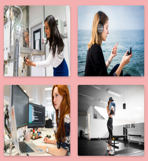
Our hover effect will display the info and remove classes over our image, as follows:
Object-fit
Our <img> elements' behaviour needs to be a bit different from the default <img> element behaviour. We accomplish this as follows:
- The
width: 100%andheight: 20remvalues tell the image to fill its entire parent width (the pin itself), but to force a height of20rem. - By default, the above will cause the image to stretch and distort (since it will be forced to that size without cropping).
- However,
object-fit: covertells the image to scale up or down (keeping its original aspect ratio) while cropping the overflowing parts of the image as needed until the entire<img>space is filled.
.image {
  width: 100%;
  height: 20rem;
  object-fit: cover;
  box-shadow: 0 4px 8px 0 rgba(0, 0, 0, 0.2);
  border-radius: 6px;
  background-color: #d18c8c;
}
If we leave out the object-fit property, then our images will get stretched as follows:
Fixed overlay
Similar to our position: absolute example above, the position: fixed rule on our overlay CSS class ejects the HTML out of the regular page flow. However, while position: absolute positions a tag in relation to any parent that has the position: relative rule applied, the position: fixed property positions an element in relation to the browser viewport itself. Therefore, since we are setting left and top to 0, as well as the size of the tag to a width and height of 100%, our overlay will fill the entire screen. Note the element is overlaid in the restricted sense of the word, meaning that even if we scroll down it will still cover the viewport.
.overlay {
  position: fixed;
  background: rgba(0, 0, 0, 0.7);
  top: 0;
  left: 0;
  height: 100%;
  width: 100%;
  display: flex;
  align-items: center;
  justify-content: center;
  box-shadow:
    0px 11px 15px -7px rgba(0,0,0,0.2),
    0px 24px 38px 3px rgba(0,0,0,0.14),
    0px 9px 46px 8px rgba(0,0,0,0.12);
}
Next steps
While the above creates all of the structural parts needed for our pinboard, it is completely static. This means that nothing happens when users press buttons or enter text into inputs. In part 2 of our project, we'll use JavaScript to make our project functional and interactive.


Latest comments (0)