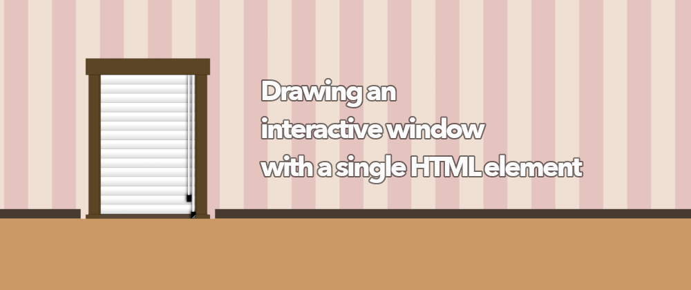
First of all, let's clarify one point: when talking about a window, we refer to an actual window like on the wall, not a window on a computer. This post will be about how to draw a window with a single <div> and how to make it interactive, so you can open/close the blinds by pulling the string.
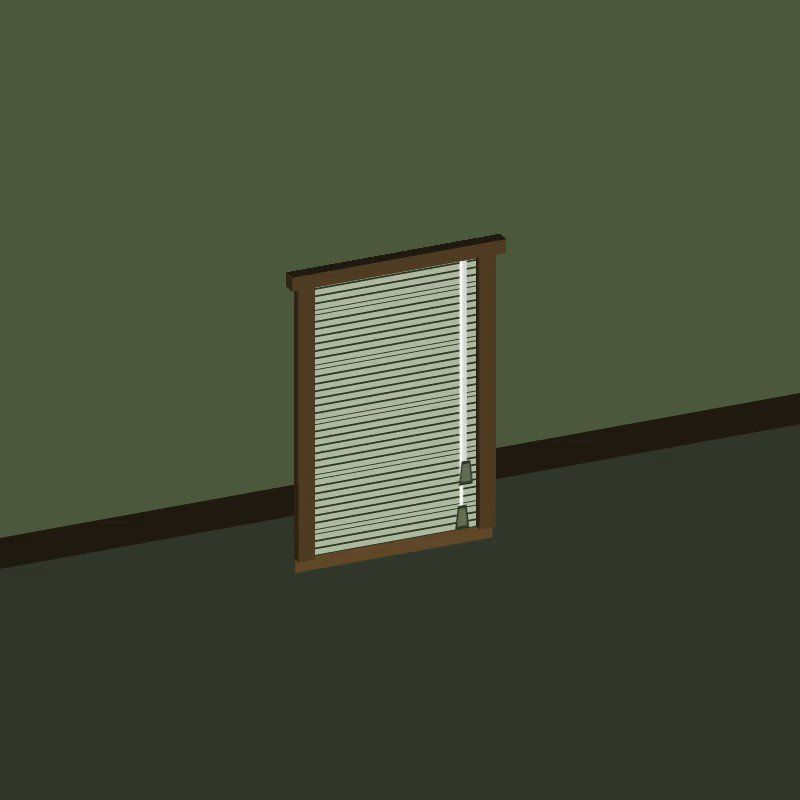
This is what we are going to develop (it looks better on larger screens, as it is sometimes tough to pull the string on mobile):
This demo was inspired by @jh3y's 3D window demo that uses the new @container query, and that you can see on CodePen too:

 Jhey 🐻🛠 (Exploring Opportunities ✨)@jh3yy
 Peter's Blinds v2 🪟
Debunking memes with CSS container queries!
This time it's tested in Chrome Canary 😅
No JavaScript required
Pull the cord(resize the element 🤫) to open blinds
Queries update custom properties 😎
cc @TerribleMia
👉 codepen.io/jh3y/pen/qBrEM… via @CodePen22:41 PM - 07 May 2021


I decided to do something simpler in 2D (I should go back to doing 3D CSS demos, it is fun.) And as a challenge, limit the number of elements to the lowest possible. In this case, that was one: a single div. I could draw the window and wall with html and body, but it was not possible to animate them (or at least I couldn't.) Initially, I was going to use the @container query too but then thought of a way of doing it without needing that new feature.
The background/wall is the html/body element (only one of them is needed) after applying multiple gradients as background-image:

With 8 gradients, we can achieve that background:
- One horizontal
linear-gradientfor the pink and cream vertical lines. - One vertical
linear-gradientfor the railing and bottom of the wall. - One vertical
linear-gradientfor the decorative top paper (just the white and blue lines) - Five
radial-gradientto make the circular pattern in the decorative paper on top.
There are two vertical linear-gradient. Why not combine them into a single one? Great question! There are some bugs in Chrome and Firefox that if a linear-gradient has too many stops (8 or more), the lines will get blurred or distorted. For that reason, I had to break one large linear gradient into two smaller ones with less than 8 stops each.
The window is a single <div> element, for which we use different box-shadow and linear-gradient to paint the frame, glass, and reflections.
With the ::before pseudo-element, we add the blinds using a repeating-linear-gradient. And with the ::after, we draw the strings for the blinds.
So far, the window is static. Just a drawing without interaction, but if we add the following CSS:
div {
  /* ... */
  resize: vertical;
  overflow: auto;
  min-height: 300px; /* same as height */
  max-height: 450px;
}
Now the window can grow and shrink vertically within the specified values (the bottom right corner of the div will be the resizing handle in most browsers.) As we used absolute values for the linear gradients and shadows, the window will give the impression that it is always the same size, but the HTML element is actually changing height.
And this is where the ::after pseudo-element comes into play. It will be the only one with relative size, so its background (used for the blinds cord) will grow along with the container.
Finally, the blinds need to go up/down depending on the size of the container... which sounds like a great opportunity for the @container query, but instead, we can calculate the height based on the height of the window (300px) and the height of the container (the div itself).
Using calc() and clamp(), we can determine which size the blinds should have based on the size of the parent:
div::before {
  /* ... */
  /* the background width is fixed, the height changes */
  background-size: 196px clamp(30px, calc(900px - 200%), 290px);
}
And that is how we get an interactive window with a single div element:
Thanks for reading. Let me know if you have any questions or if anything needs further explanation.

Latest comments (0)