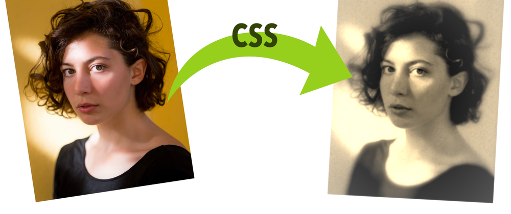
This article will review how to create an old photo effect on any picture using only CSS. No need for Photoshop or any other image editor. And all in just a few lines of code!
We will check three different methods that build on top of each other, increasing the old photo effect with each iteration to make it look more realistic and nicer.
For the examples on this page, we will use a photograph by Filipp Romanovski. You can find it on Unsplash, along with many other amazing pictures (by Filipp and many more authors.)
Using an Image Tag
The most basic way of creating the old photo effect is directly applying filters to an image in the <img /> tag. This method is quick, and the effect will be nice, but the result may be too basic.
Let’s start with an image in HTML:
<img src="link-to-your-image.jpg" alt="Description of the image" />
Then we will apply some filters in CSS and a simple mask:
img {
  filter: grayscale(1) blur(1px) contrast(1.2) sepia(1);
  -webkit-mask: radial-gradient(#000, #0009);
}
Let’s see one by one what each of the filters does:
-
grayscale(1): turns the picture into a scale of grays. This will blend some areas together into a similar tone of gray, making the picture lose some detail. -
blur(1px): applies a Gaussian blur to the image. Enough to combine color regions and make the picture lose more detail. -
contrast(1.2): sharpens the picture. We can play a little with the value to adjust it to what we want and personalize it for each picture. But beware: too high or too low, and it will look weird. -
sepia(1): changes the color into an old-photo sepia.
Additionally, we could add an extra blur(0.5px) (it doesn’t have to be a round number or higher than 1) to make the photo just a little bit blurry and complete the filter effect. But it’s not needed.
There’s one extra line for -webkit-mask. Old photos seem more focused in the center, but then they degrade, losing color and getting a bit blurry toward the edges. We can achieve that by applying a mask in CSS. Unfortunately, mask is not supported by all browsers... luckily for us, the vendor prefix is! So we can apply the same effect using -webkit-mask.
With -webkit-mask: radial-gradient(#000, #0009), we are telling the browser to make the edges of the image semi-transparent (by using a fully visible ellipse at the center, which fades towards the outside), so the picture will fade and blend with the background. Notice that this could have different results depending on the background’s color!
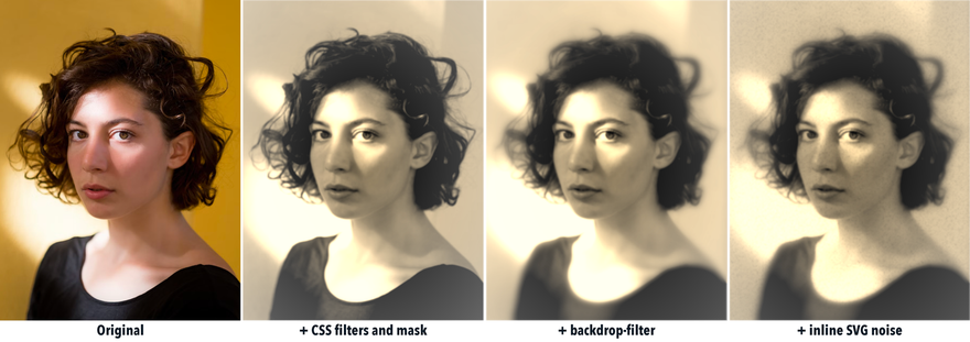
After we apply these 4 lines of CSS, we achieve the old photo effect. Here’s a comparison of the original with the resulting picture:
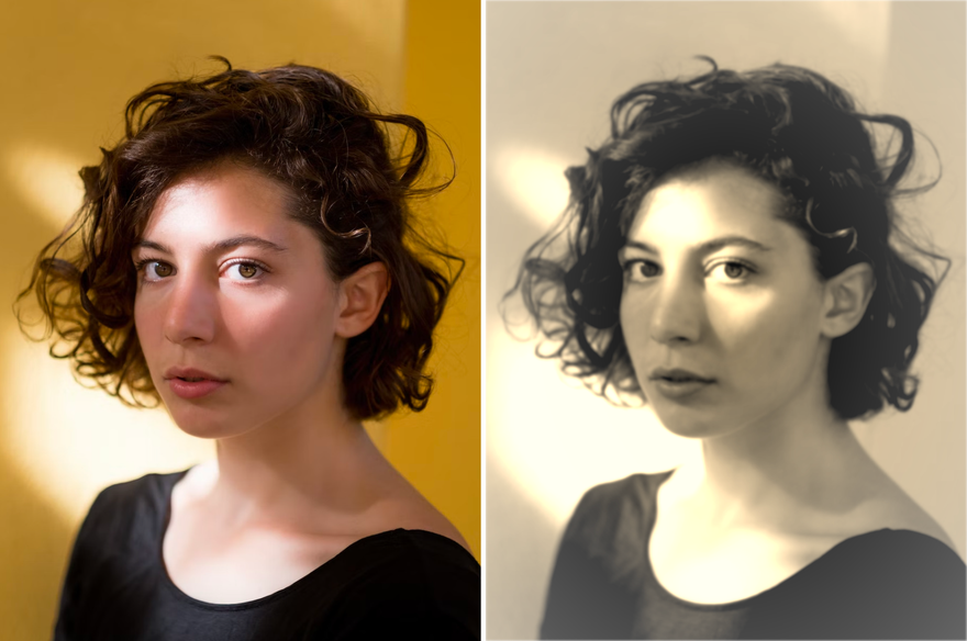
Not bad, but we can take it one step beyond.
Adding Pseudo-Elements
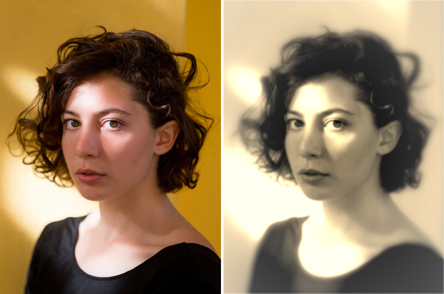
One problem with using a single <img /> tag is that images don’t have pseudo-elements like ::before or ::after, and that limits the effects we can apply to the element. If instead of using an <img /> we used a <div> and added the image as a background, we could apply filters and masks to its pseudo-elements and obtain a more accurate effect.
Getting a similar result as with the <img /> tag would be simple. The HTML would look like this:
<div class="old-style-photo demo-image"></div>
Then, in the CSS, we would use the element to display the old-style photo, just like in the section before. The only difference is that we need to set the size and the image as a background, too:
/* specific to the demo image */
.demo-image {
  width: 45vw;
  aspect-ratio: 3/4;
  background: url(https://assets.codepen.io/1506195/portrait-woman-unsplash.jpg);
  background-size: cover;
}

/* needed for the pseudo-elements and old-photo effect */
.old-style-photo {
  position: relative;
  filter: grayscale(1) blur(1px) contrast(1.2) sepia(1) blur(0.25px);
  -webkit-mask: radial-gradient(#000, #000a);
}
Just with that, we have the same effect as in the previous section. We will use the ::before pseudo-element to blur the edges of the image. Something common in old photographs. To achieve this, we will use a mask again. Another radial gradient from center to edges, but this time will be in the opposite direction: hidden at the center and visible at the end. This way, we can apply a backdrop-filter effect on the image itself.
With backdrop-filter, we can apply a filter to the area behind the element. Because the center is cropped with the mask, the filter won’t be applied to the center of the image, only to the visible areas and the degree of visibility according to the mask. For example, if we apply a blur() backdrop filter, it will be blurrier toward the fully visible edges than towards the middle section that is only partially visible.
.old-style-photo::before {
  content: "";
  position: absolute;
  width: 100%;
  height: 100%;
  -webkit-mask: radial-gradient(farthest-side, #0000 30%, #000);
  backdrop-filter: blur(5px) sepia(90%);
}
The resulting image is blurrier around the edges, plus we added more sepia to the mix (so colors combine even more):
Blending an Inline SVG
Some people will cry foul, say this is “not a pure CSS solution” (I never claimed it was), and consider this section cheating. Instead, we’ll call it “taking advantage of all the features CSS has to offer” and claim it as a win in our book.
Yes, it is true. This last step will include some SVG. The reality is that CSS has filters, but they are not as diverse or advanced as the ones from SVG. Fortunately for us, we can combine both technologies in a relatively straightforward way.
One option would be to have some inline SVG in HTML and reference it from our CSS. Another option we’ll use is inlining the SVG directly in CSS (without adding anything on the HTML side.) This is possible by adding the SVG as a background with the url() function combined with data URIs:
data:[<mime type>][;charset=<charset>][;base64],<encoded data>
In our case, we don’t even need to do base64 encoding. It’s a simple SVG, and we can just put it as text in the data URI:
<svg xmlns='http://www.w3.org/2000/svg' width='100' height='100'>
  <filter id='noise' x='0%' y='0%' width='100%' height='100%'>
    <feTurbulence baseFrequency='0.5' />
  </filter>
  <rect x='0' y='0' width='100%' height='100%' filter='url(#noise)' />
</svg>
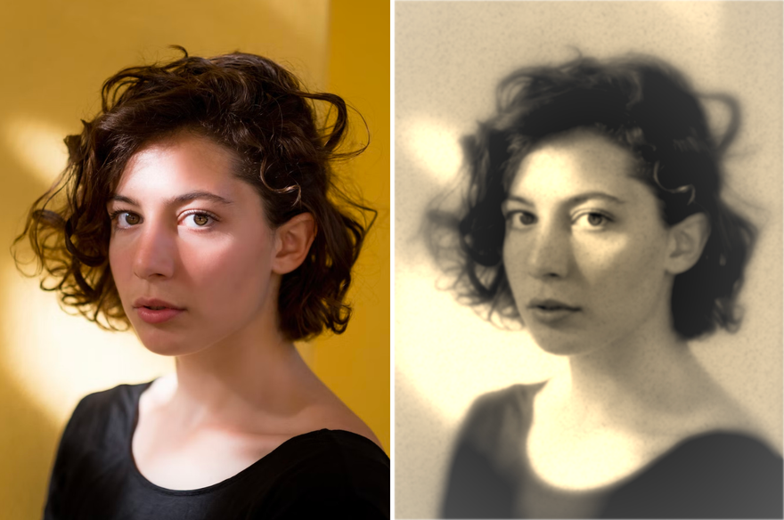
The only thing that we need to be careful with is the # in the filter. It will need to be URL-encoded and replaced with a %23. Then we’d apply the property to the ::after pseudo-element:
.old-style-photo::after {
  content: "";
  position: absolute;
  width: 100%;
  height: 100%;
  opacity: 0.6;
  background:
    url("data:image/svg+xml;utf8,<svg xmlns='http://www.w3.org/2000/svg' width='100' height='100'><filter id='noise' x='0%' y='0%' width='100%' height='100%'><feTurbulence baseFrequency='0.5' /></filter><rect x='0' y='0' width='100%' height='100%' filter='url(%23noise)' /></svg>"), #f003;
  filter: grayscale(100%) contrast(150%);
  mix-blend-mode: darken;
}
The noise in itself has different colors, but it will be monochrome now because we applied some color filters to the parent that will affect the pseudo-element too. Still, we can apply additional filters (not required) and a blend mode to better mix with the original picture. I highly recommend using different values of mix-blend-mode: darken and multiply yield great results for the effect we want (but feel free to try with others.)
The result is the same image as before, but we have a granular/noise effect that adds more realism to the old-photo image:
Conclusion
In this article, we have seen how to create an old-photo effect step-by-step using only CSS (and a small inline SVG) without resorting to external files. All the code is self-contained and can be applied at the level that we want to achieve the desired effect:
Changing the values in filters and masks will generate completely different images. Feel free to download the code and try it locally or play with this demo on CodePen:
More examples
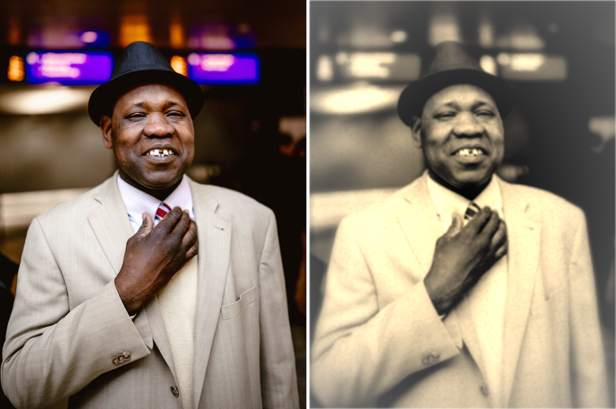
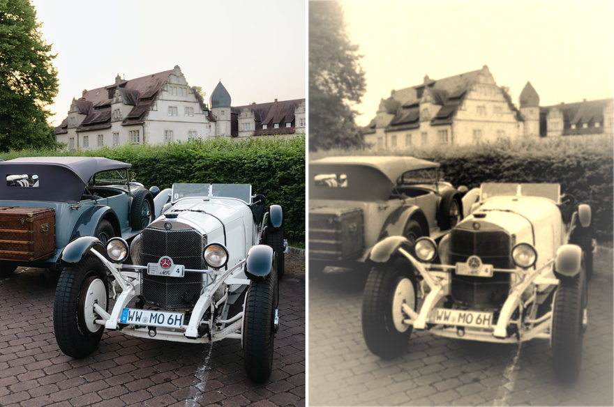
To show that this effect actually works in general and it's not just something specific to the demo image, I applied it to a few more pictures (all original by Filipp Romanovski on Unsplash):
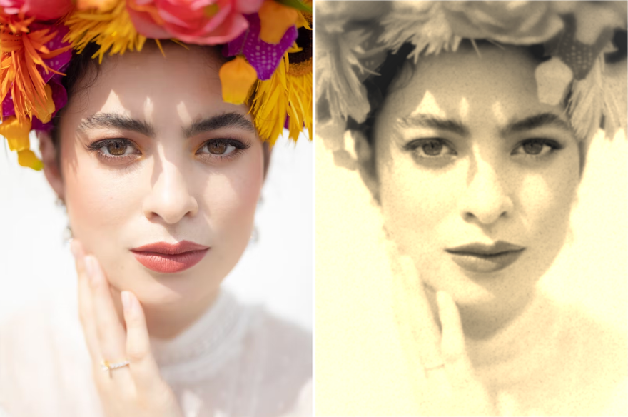
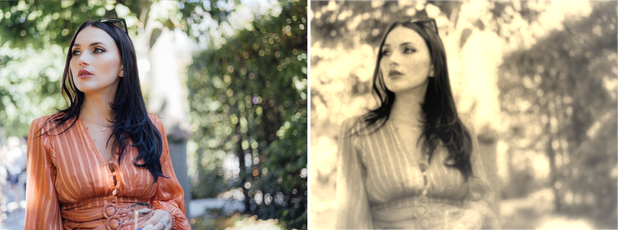
We can change the center of the radial gradients to focus on the area that we consider more important. For example, the gradients’ center is closer to the face in this photograph:
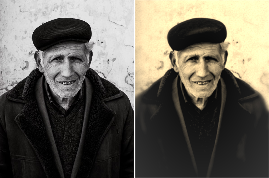
I like using pictures of people for the effect, but it will work without people, too. Especially well if the subjects of the photo are old-timey objects:

Oldest comments (3)
Hello Alvaro! This is random, but how do you format your blocks of code? I know you can us backticks but I noticed it just is a block of white code. But yours has 🌈 color 🌈! Do you use a specific embed or syntax? Thank you for any help!
You can specify some languages after the backticks to give the code some flair. For example:
-
```javascript: will highlight JavaScript code
(no space between the backticks and the language name, markdown acts funny when mixing code in code)
Thank you, this is great!