
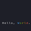
A reddit user asked in the CSS channel if there was a way of building a typewriter effect. Some people pointed out at Geoff Graham's article on CSS Tricks (which includes different versions in CSS and JS), and many more recommended using JavaScript or some JS libraries/modules... and I tried to come up with my own CSS-only version:
The idea is to animate the content property of a pseudo-element like ::before to show one character at a time. And then, we can use the ::after element to display a blinking caret.
The content property is discretely animatable. This means that there won't be transitions –it would have been nice–, but it will still animate it "step by step," which it's exactly what we want.
It is not perfect, but it can be eye-catchy, and it has some nice pros compared to similar CSS-only solutions. Also, it is slightly customizable (the caret can change color and size), and I tried to make it as accessible as possible.
The main issue is calculating the steps and the time at which they must happen. To simplify and generalize the process, I created a short JavaScript snippet to help generate the animation steps for any set of words... Unfortunately, although it works in most cases, my math is wrong, and it sometimes fails. (I'll add a link once I verify it works fine.)
Pros and Cons
Pros of this approach:
- It is multiline: many of the CSS-only typewriter animations only work for single lines/words. This one will work in multiple lines too.
- It doesn't cut letters/words: each letter is added individually instead of hiding with overflows that may display them partially (as it happens in other solutions).
- No need for monospace fonts: related to the point above. Other animations only work with monospace to go around the cutting words/letters issue. This one will work with non-monospace fonts too.
Cons of this approach:
- Requires some accessibility boost (see below): in my defense, most animations that do this (CSS or JS) have this issue.
- It involves a lot of code: the CSS animation will have as many lines as letters are in total... which is annoying, but in some cases, it may still be less code and less weight than with a JS solution.
- It is a pain to write the animation steps: a lot of calculations! So I created a small script to generalize the process.
To go around this last part, maybe I could have used the steps() timing function. But in the end, it would require some (simpler) calculations too.
Accessibility
We are going to do a couple of things to boost the accessibility of this animation... and one of them consists of removing the animations 😅
First, while a sighted user can see the text changing, that may not be the case for a user of assistive technologies (AT). For example, a screen reader user won't get information about the text growing/shrinking –and thank you, because it would be a pain in the neck!
To avoid getting a half description of the title, we should add an aria-label to the container with the full description.
<h1 aria-label="I'm a developer, writer, reader, and human.">
I'm a <span class="typewriter"></span>
</h1>
Without the aria-label, screen readers will read the title as "I'm a"; with the aria-label, they'll read "I'm a developer, writer, reader, and human.", which is much better.
The other thing we can do to make the component a bit more accessible is to remove the actual animations. If a user has the reduced motion setting on, we should stop the caret blinking, leave it fixed, and maybe show the words fully instead of letter by letter. To do so, CSS counts with the prefers-reduce-motion media query:
@media (prefers-reduced-motion) {
  /* let the caret be fixed instead of blinking */
  .typewriter::after {
    animation: none;
  }

  /* replace the letter popup for a shorter animation */
  @keyframes sequencePopup {
    0%, 100% { content: "developer"; }
    25% { content: "writer"; }
    50% { content: "reader"; }
    75% { content: "human"; }
  }

  .sequencePopup::before {
    content: "developer";
    animation: none;
  }
}
We didn't fully remove the animation; we only replaced it with another that is more accessibility-friendly. Not all animations are bad, and "reduced motion" doesn't mean "no motion."


Latest comments (0)