
Let's make an easy and simple circle progress bar from an animated SVG in a React component. We only need a SVG, some hooks and a bunch of props to make it customizable.
The scope of this guide is to make a simple but customizable circle progress bar for starting at a very basic level of SVG animations.
If you want to skip the guide and check/fork the final result you can do it here and in this playground.

Folder structure
I'll be following this folder structure:
-src
|-components
|--CircleProgressBar
|---index.js
|---CircleProgressBar.js
|---CircleProgressBarBase.js
-
index.jswill import/exportCircleProgressBar.js, is a good practice and is easy when you want to import the component. -
CircleProgressBar.jswill hold the styled version ofCircleProgessBarBase.js. I'm using styled-components and I like to wrap the entire component in a separate file and working like in a normal CSS. We can discuss this part (or any other, but specially this one :D) -
CircleProgressBarBase.jswill have all the magic, like any other regular React component.
Basic Maths
Don't fear, this will be short and painless I promise!
const circleConfig = {
  viewBox: '0 0 38 38',
  x: '19',
  y: '19',
  radio: '15.91549430918954'
};
We create this circleConfig object which have:
-
viewBox: The current viewbox (min-x, min-y, width, height) for the SVG. -
xandyare the position of our SVG which is exactly the half (the middle) of the viewbox. -
radiois exactly a circle with a circunference of 100, why 100? Because is easy to understand to us in further calculations. Then, if you apply the formula for getting the radius (r = circunference / 2 π) you'll get the magic number.
Later when we write the circle in html we'll use this calculations.
Basic SVG
First of all, let's create the SVG, without any animations or props:
<figure className={className}>
    <svg viewBox={circleConfig.viewBox}>
        <circle
          className="ring"
          cx={circleConfig.x}
          cy={circleConfig.y}
          r={circleConfig.radio}
          fill="transparent"
          stroke="gray"
        />

        <circle
          className="path"
          cx={circleConfig.x}
          cy={circleConfig.y}
          r={circleConfig.radio}
          fill="transparent"
          stroke="teal"
        />
    </svg>
</figure>
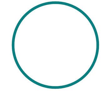
We're using the calculations we wrote above and have two elements inside of the SVG:
-
ring: This circle will be used as the remaining content, if the main stays at 80%, this will be the 20% lasts. (For now is not visible btw) -
path: Will display the percentage/value, for now it's a 100% (all the circle).
Add strokeDasharray="75 25" to the second circle and check what happends.
The idea behind these numbers is strokeDasharray creates dashes in the stroke of a SVG shape. We're creating one stroke of 75 with color teal and other stroke of 25 transparent which allows to see the gray circle behind.
Because we're coming from a circle with circunference of 100, now the values for percentages are out of the box without any additional calculation :D
Now you can see both circles but... something is wrong, we want to start our progress bar at 12 o'clock, now it's starting at 3, for fix that, we need to add the property strokeDashoffset.
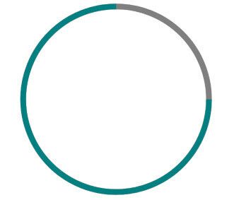
We want to "move" the stroke a 25% behind of his current position. For that we will use strokeDashoffset="25" in the second circle again.
Ok now is looking good!
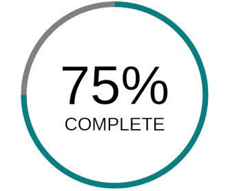
Display Text
We have a SVG which displays some kind of progress, let's add a number to display the exact number of progression and what mean that progression.
Inside of our current SVG:
<figure>
    <svg viewBox={circleConfig.viewBox}>
        <circle
          className="ring"
          cx={circleConfig.x}
          cy={circleConfig.y}
          r={circleConfig.radio}
          fill="transparent"
          stroke="gray"
        />

        <circle
          className="path"
          cx={circleConfig.x}
          cy={circleConfig.y}
          r={circleConfig.radio}
          fill="transparent"
          stroke="teal"
          strokeDasharray="75 25"
          strokeDashoffset="25"
        />
        <g className="circle-label">
          <text x="50%" y="50%" className="circle-percentage">
            75%
          </text>
          <text x="50%" y="50%" className="circle-text">
            COMPLETE
          </text>
        </g>
    </svg>
</figure>
We need to add some styles, for that in CircleProgressBar.js add:
import styled from 'styled-components';

import CircleProgressBarBase from './CircleProgressBarBase';

const CircleProgressBar = styled(CircleProgressBarBase)`
`;

export default CircleProgressBar;
Inside of the template literal let's add the css:
.circle-label {
    transform: translateY(0.25em);
}

.circle-percentage {
    font-size: 0.6em;
    line-height: 1;
    text-anchor: middle;
    transform: translateY(-0.25em);
}

.circle-text {
    font-size: 0.2em;
    text-transform: uppercase;
    text-anchor: middle;
    transform: translateY(0.7em);
}
At this point we have a regular SVG circle progress bar, let's a few tweaks to make it dynamic and valuable as a React component.
Basic Props
Let's implement this props:
-
trailStrokeColorfor the stroke color in the ring circle. -
strokeColorfor the stroke color in the path ring. -
percentagefor the total %. -
innerTextfor the meaning of percentage.
Names of the props are totally up to you.
The CircleProgressBarBase.js with props now:
import React from 'react';

const INITIAL_OFFSET = 25;
const circleConfig = {
  viewBox: '0 0 38 38',
  x: '19',
  y: '19',
  radio: '15.91549430918954'
};

const CircleProgressBarBase = ({
  className,
  trailStrokeColor,
  strokeColor,
  percentage,
  innerText
  }) => {
    return (
        <figure className={className}>
            <svg viewBox={circleConfig.viewBox}>
                <circle
                className="ring"
                cx={circleConfig.x}
                cy={circleConfig.y}
                r={circleConfig.radio}
                fill="transparent"
                stroke={trailStrokeColor}
                />

                <circle
                className="path"
                cx={circleConfig.x}
                cy={circleConfig.y}
                r={circleConfig.radio}
                fill="transparent"
                stroke={strokeColor}
                strokeDasharray={`${percentage} ${100 - percentage}`}
                strokeDashoffset={INITIAL_OFFSET}
                />
                <g className="circle-label">
                <text x="50%" y="50%" className="circle-percentage">
                    {percentage}%
                </text>
                <text x="50%" y="50%" className="circle-text">
                    {innerText}
                </text>
                </g>
            </svg>
        </figure>
    );
};

export default CircleProgressBarBase;
Worth to mention:
-
classNameis needed because the styled-prop will pass the CSS classes with this. -
strokeDasharray={${percentage} ${100 - percentage}}is the calculation we hardcoded before as75 25.
Now import in a different js file the component with props and check the result:
import React from 'react';

import CircleProgressBar from './components/CircleProgressBar';


const App = () => {
    return <CircleProgressBar
              trailStrokeColor="gray"
              strokeColor="teal"
              percentage={75}
              innerText="complete"
            />
}

render(<App />, document.getElementById('root'));
Number Animation
Let's add an animation in the number, from 0 to the value passed into percentage.
The strategy will be, use the state, because a React component only re-render if his state or props changes. We will need useState and useEffect hooks from react.
const [progressBar, setProgressBar] = useState(0);
progressBar now is the state of the component, starting at 0, and can be "modified" through setProgressBar.
  const updatePercentage = () => {
    setTimeout(() => {
      setProgressBar(progressBar + 1);
    }, 5);
  };

  useEffect(() => {
    if (percentage > 0) updatePercentage();
  }, [percentage]);

  useEffect(() => {
    if (progressBar < percentage) updatePercentage();
  }, [progressBar]);
The first useEffect will be triggered when percentage prop is changed. This is needed instead of a simple [], that will be on mount, because if you use this component in combination with a backend service you first will pass percentage={0} and later in async mode, a value.
The second useEffect will be triggered when the progessBar is modified.
Both effects will execute updatePercentage, that function executes a timeout which will execute the inner function in 5 milliseconds.
Now your CircleProgressBar will "fill" the number from 0 to the value passed through percentage prop at a constant time of 5ms, seems an animation but in fact it's a simple re-render.
Try to use different values than 5ms and check the behaviour.

Stroke Animation
Let's enter to the real deal, the number is already "animated" now it's time to the stroke.
The strategy will be the same than before, we can apply a good looking CSS animation but... we already have one value which indicates the percentage and would be nice if the stroke and the number dance together.
Use progressBar for the calculations in strokeDashArray:
// strokeDasharray={`${percentage} ${100 - percentage}`}
strokeDasharray={`${progressBar} ${100 - progressBar}`}
Now the stroke will grow with every re-render at the same speed than the number. I guess we can't really call this an animation after all.
Extra Stuff
In the Github repo you can find extra stuff made in the component such as:
- A prop
speedto choose which speed want to use in the "animation". - A legend to display with the Circle.
- The
ringcan be spaced or solid like in the example. - Prop type validation and default prop values.
Conclusion
We learn the creation of a simple SVG shape with "animations" in a isolated React component.
The component can be extended in multiple ways, for example removing the local state and passing the progressBar from outside as a prop to display a real progression in the comunicacion with a service using RxJS.
The repo is open for any improvement or customization you may think would be cool and is available for use with:
yarn add @bit/dastag.ui-components.circle-progress-bar
Enjoy!


Top comments (0)