What’s updog?
- Jim Halpert
I’m listening to Elton John. What’s wrong with me? 14 year old Jose would be ashamed of what I’ve become. Sorry… I can’t write with that dude in the background. Let’s put on a classic.
Picking up where we left off…
We’ve moved from using the <style> attributes within HTML tags to using the actual <style> tag the in the head of the HTML doc. This is our introduction to the CSS rule. Much easier on the eyes. I always find it odd that people who are comfortable with JavaScript find CSS confusing. To me this syntax is the most straightforward. I remember the first time I saw the CSS rule and thinking “this makes sense.” It’s actually a lot of fun so it’s easy to get carried away. Sometimes I’ll go nuts and style an element to the point where it makes more sense to just throw together an image in Affinity Designer.
Next up was our first challenge. For this we had to create a multi-page site with a nested file structure. Nothing too crazy. Some trial and error. Lots of page refreshing and questioning if you put the 2 periods and slash in the right order, in the right place — welcome to coding. Aside from that we had to style each page slightly differently. For mine I referenced this awesome color palette generator and threw in some linear-gradients to accent each block element. If you’re interested you can check it here.
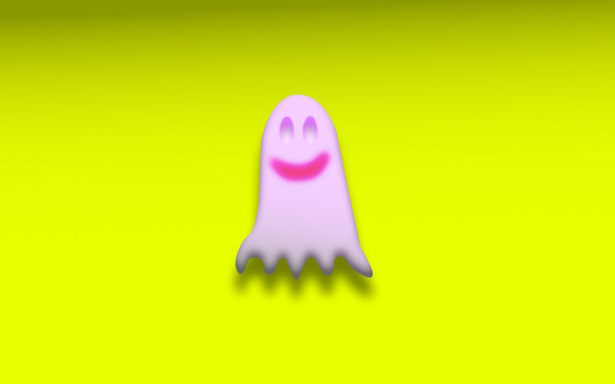
For the next lesson we got introduced to the pen tool in Affinity Designer and CodePen:
-
The Pen Tool
- Takes some getting used to.
- I can see it’s power but I suck at it right now.
- Slowly gaining a natural sense of how to use it.
- Created this creepy ghost with hollow eyes (see fig. 1). Don’t judge me.
-
CodePen
- Love this site. Great for workshopping ideas, collaboration, inspiration, etc.
- Had to create text with an image inside it
- I chose CAGE and put a different image of the controversial Nicolas Cage inside each letter.
- Chose a font with a thick width so I could get his face in there.
- Messed with some CSS properties I don’t fully understand but hey! I got a working model. Looks cool too. Check it here.
- He looks so “at home” with a fire background.
-
Had to create a pen using the
float:property- Never used this before. I find it useful but a lot of devs don’t seem too stoked on this.
- Created my own version of this page from the Forest Park website.
- Used an image of the Olmstead bros for the
float:property. - Interested? Check it here.
Hello <iframe>s and hash links. Got familiarized with embedding the YouTube videos on a webpage. <iframe>s have their use but Derek showed us how if used incorrectly they can mess up the google search for your site. Hash links are pretty standard if you’re setting up a single page site. Easy and intuitive. Added some smooth scrolling with hash links to the Dead Moon redesign I’m having fun with. Check it here.
Next up we learned about CSS resets. There’s all these automated sizes and margins when you don’t reset, so it’s nice to build from scratch and have full control. Along with that we learned about some useful CSS properties like letter-spacing: and line-height:. Never thought twice about these 2 things but now I can’t unsee it. Also learned how to combine selectors to style multiple elements at the same time. For the sake of practice, I got a little wacky with styling this page.
Like I’ve said in the past, some days at PE aren’t completely buried in the computer. To take a break from coding we learned about the history of printing. We watched 3 documentaries. All really cool and interesting. I really enjoyed the last one on Linotype. It was a bit sad seeing it get phased out in favor of computers but you can’t argue when computers can pump out 1,000 lines a minute whereas the Linotype machine can only do 14. The scene with the guy using the machine one last time was particularly sad. He’s just drags his fingers slowly across the keys, trying to make the most of it.
Derek took a day off so Drake could teach us about box-sizing:. Thanks Drake.
Now that we’re a bit more comfortable using CSS and HTML we were tasked with styling an article. The goal was to try and make it look legit and fun to read. I started thinking of random topics I’m interested in and looked up an article on Slab City. I took the text and photos from this NPR article and styled it in my own way. I initially made a colored version but then noticed that that we were suppose to make it black and white. Whoops. Did a quick fix. Always knew that double border would look cool at some point. Adjusted the font for SLAB in the title too. Did a google search for “CSS make photo grey” and up came the MDN doc for the filter: property. Pretty cool.
Believe it or not, Bill Murray hired me to make his personal site. Well… Derek pretended to be him — same thing though. William (as his friends call him) has no taste. You’d figure all that time spent with Wes Anderson would have a profound effect on him but I guess not. This exercise was just a fun intro to what it might be like working with a client. I look forward to deleting these from my CodePen archive. Marble backgrounds? 🤮
Moving onto semantic markup and the inner-column — a good standard way of designing a page. Basically you set the content of each display: block; element inside a <div> to make an inner-column. Looks nice and organized when you put a <border: 1px solid red;> around everything.
After learning this William( 🤡 ) contacted me again to update his site. He let his friend take a stab at it. She did pretty good but I had to do a few quick fixes. This was more so practice for semantic markup, creating an inner-column, and spotting redundant CSS declarations.
Now we’re jumping from CodePen and back into Sublime to revisit our multi-page site. When we first built this it had no styling but now we’re tasked with creating one style sheet that can be applied to every page. Kept it pretty simple for this one. Just used a subtle color combo and the Roboto font. Really basic styling depending on font-size: and font-weight:. I like it. Hey! I added my movie lists to the site if you’re ever bored and don’t know what to watch.
Following this we had another easygoing day. This time we watched a documentary on Helvetica. Another one of the those things I can’t unsee now that I’m aware of it. I thought I was a nerd but holy crap, I got nothing on these typography nerds. Some of those scenes reminded me of Spinal Tap and King of Kong. I like the scene where David Carson (sort of the anti-Helvetica dude) looks at the word caffeinated (spelled in Helvetica) and says, “that doesn’t say caffeinated!”
Back to coding. Now we get to research, plan, and execute a project. We had to do a lot (for me) within the time constraints. This was fun but some of my code is super wonky. Hey, desperate times call for desperate syntax. For this one I made a tame version of Jacob Leach’s personal site. Here’s my sad version.
Welp, that’s the gist. See ya again next week! ✌️
…craving some Elton John.

Top comments (0)