Oh hi,
Another blog. Another ambient album. Another week at PE.
I’m not linking the album this time because it’s too embarrassing.
What else? …I watched Terminator 1 & 2 back-to-back recently. They hold up.
Sorry. On with the blog! Here’s the gist…
Idea Boards
What is an idea board? What is a mood board? What’s the difference? I dunno. They’re both pretty interchangeable. The general goal is to express an idea or search for one by using found images, illustrations, designs, etc.
Think of Beetlejuice. Imagine your Tim Burton and you’re trying to describe this character without using images. It would be super weird. The actors auditioning for the part would probably think it was a prank. I’m sure something as simple as an idea board/mood board would be way more effective at getting his vision across.
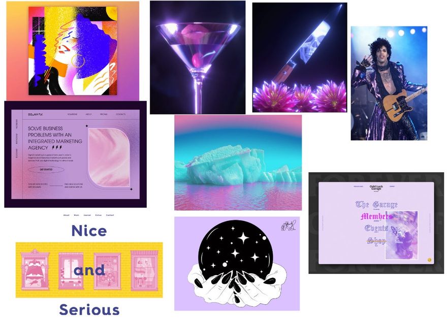
For this lesson I created a few boards. At first I didn’t really have a direction. I just looked at everything I collected in my inspiration folder and started throwing stuff together. Eventually some ideas started flowing and I could organize them into themes and colors.
For this one I started with the color purple and then it morphed into a mood board that could maybe work if the client is a Psychic and/or sells pseudoscience products.
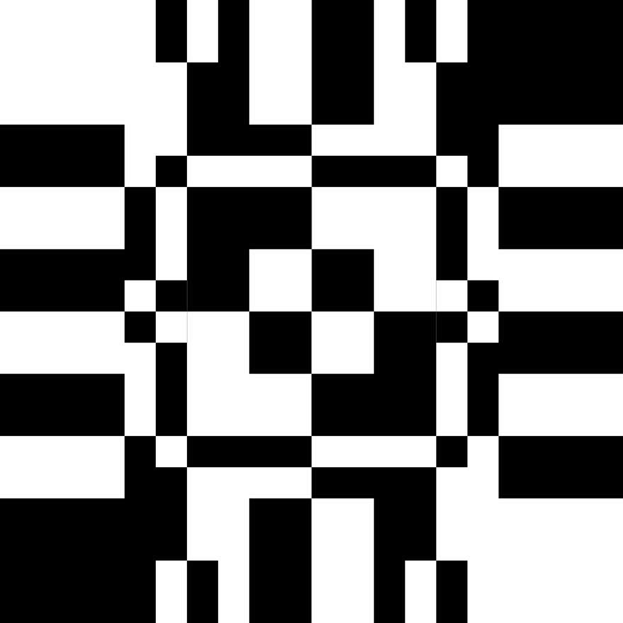
Gray Scale
Creating with black and white. Creating with various shades of grey. I like these limitations. Whenever colors are involved I’m constantly second guessing my choices.
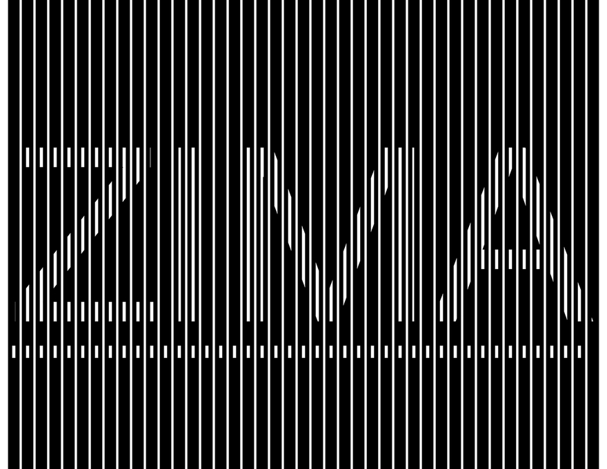
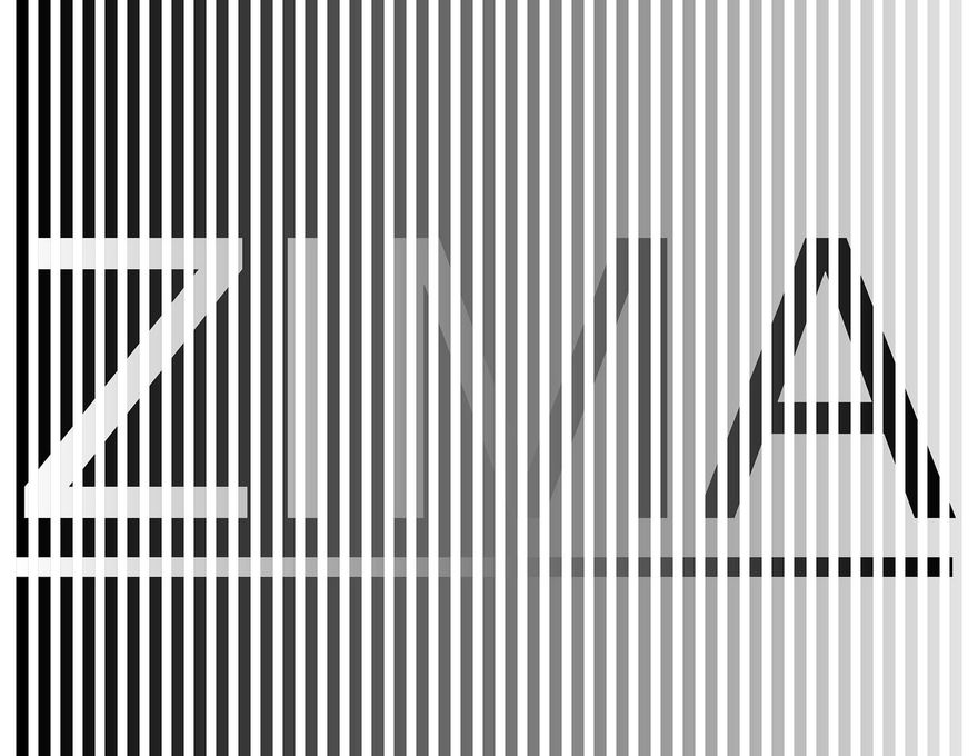
For this first design I created 2 separate layers of vertical lines and place a layer of text inside on them. With every little alteration you get some really cool results — to the point where I can’t really decide which one is my favorite. Would be fun to incorporate this into a site where the line-spacing changed on scroll or with the viewport width.
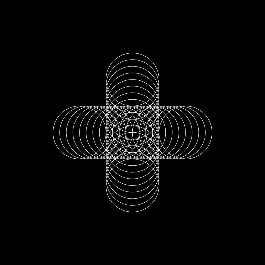
For the 2nd design I started with one square in the direct center and kept adding squares of divisible size in a symmetrical way. Got some happy mistakes using the negative blend mode too.
Simple method to get the juices flowing:
If I don’t know what to do, if I have an empty canvas — I should just pick a shape, make it black and white, place it in the center, and start building symmetrically. The design sort of presents itself and I’m ultimately happy with the results.
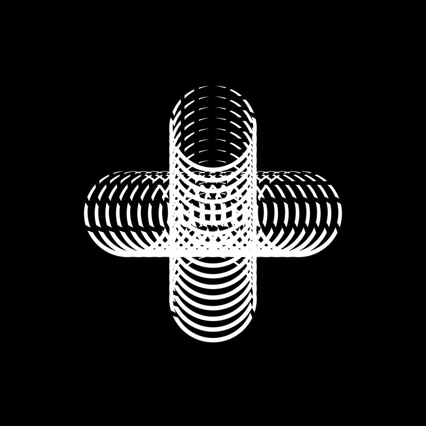
For the 3rd design I did something similar.
Would be cool to animate this. Maybe have each circle come in from a different angle to form the cross?
Variation on that design using an engraved brush style.
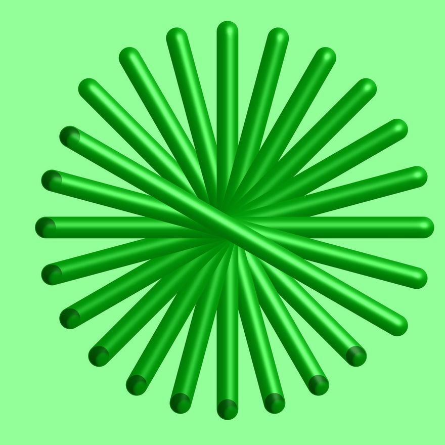
For the last exercise I had to create a design only using different shades of grey. Also added some 3D and shading.
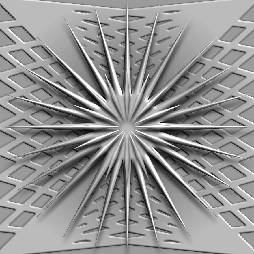
As a bonus Derek asked us to create a green version with the same limitations. This is what I got.
S P A C E
I have a problem with jumbling everything together in my designs. I need to let them breathe. I need to consider where the user’s eyes are traveling when they look at my designs. I need to think of more interesting ways to make my document flow. I haven’t really ventured out of the standard format.
For this one we revisited our mood boards (I like saying that better than idea boards) and rearranged them using the power of S P A C E.
I didn’t really know what I was doing so I just rearranged mine and added some images to tell a loose story. I think it’s one of those things where I could make better design choices if there was some copy, some idea and/or goal to dictate the use of space. Y’know, higher stakes. Just using random images and spacing them out didn’t really get the juices flowing for me.
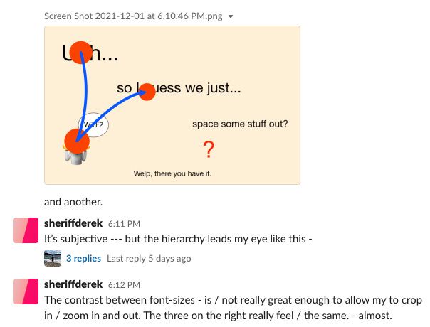
Derek marked mine up which revealed 3 crosses. Didn’t even mean to do that… so in a way I guess I was successful at telling the loose story.
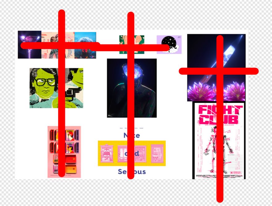
Derek’s feedback on this is where the purpose of the lesson started making more sense to me. Another Whoops.
Sort of fumbled this lesson but hey, that’s a part of learning. You gotta eat sh*t every once in awhile in order to get better.
Contrast
This lesson helped me gain a better understanding of how to use weight, how to use spacing, and how to create hierarchy in interesting ways.
We watched a video where these design teachers analyze students work and it was really eye-opening. Some of the work was super ambitious. Sometimes they were practically unreadable but still looked cool. I guess it depends on how crucial the information is? They would also alter the documents and rearrange them in a more refined way. Now everything I look at, I analyze it in the same way. I just want to get my hands on some interesting content so that I can design some unique layouts.
Also read the typography rulebook. I broke several of them. Another whoops .
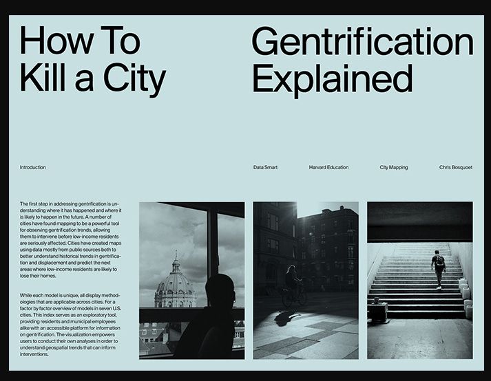
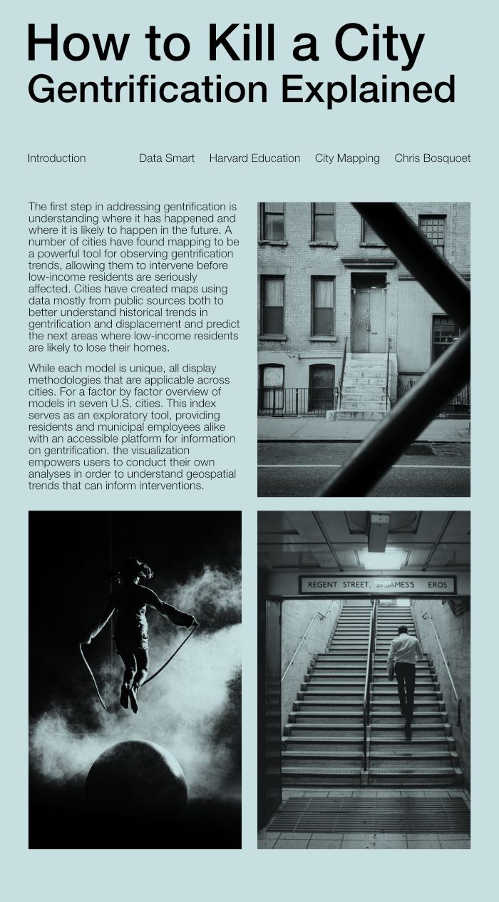
Research and Employ
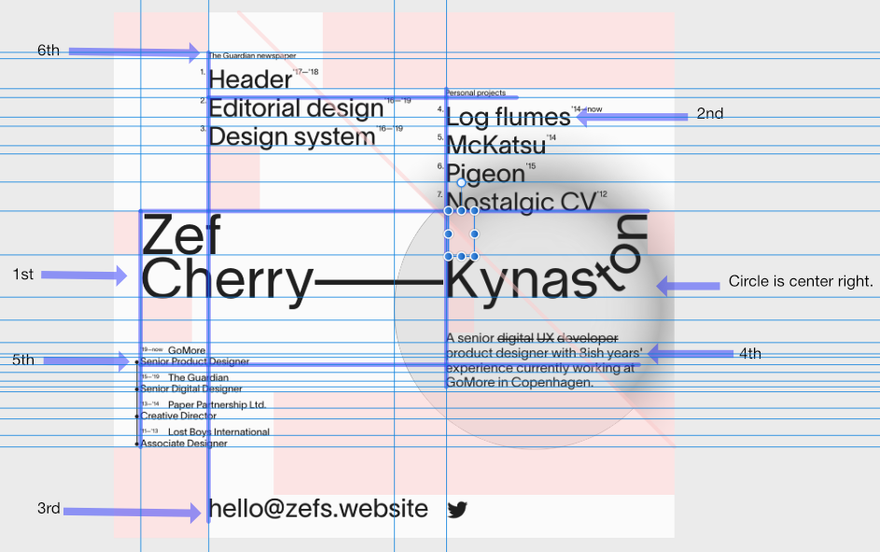
Now we have to choose a design, mark it up, and analyze it. I wanted to pick an interesting/abstract design so I went to Site Inspire and started searching til something caught my eye. Landed on this awesome design, took a screenshot and threw it in Affinity.
I changed the image to black and white so I can get a better sense of the weight and dimensional aspects. For this design it’s pretty obvious but still good practice.
Next I set the horizontal and vertical guides (those thin blue lines) to see how the different elements line up with each other. I remember at first glance thinking the designer just positioned the elements at random but now I can clearly see the relationship between the elements (those thick blue lines).
Instead of using a ruler to measure the spacing I used block nodes (those pink boxes). The first block I made was for the margin in the upper left corner. After that I copied it and started searching for other spots where block or multiplied versions of that box would fit.
The numbers with the arrows on the side indicate hierarchy. What do your eyes see first when you look at this? Where do your eyes go next? Interesting how this person does it. Take note of the list styling. Those headers, the numbers, the superscript — pretty unique but it works. Usually people make headers bigger than everything else but I think the goal of the designer was to have the emphasis be on their actual work.
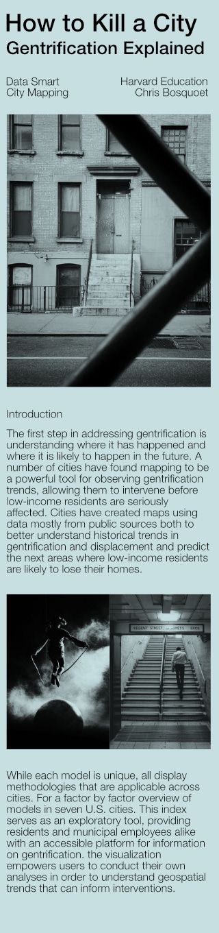
Thought I was finished with this lesson til…
Alright, probably would’ve picked a less crazy site but here it goes… check out my extremely sad chaotic version.
Even though I failed miserably I learned a ton of stuff. Specifically how to make units of measure more dynamic and how to wield the power of the transform property. I'm sure if I presented this as something to collaborate on every developer would be like “wtf is this?” This is just one of many wtf moments. I look forward to having more. I eventually reached a point where I lost control of the design and started haphazardly positioning the elements but hey, it’s working and I learned a lot.
How to Kill a City
For this weeks boilerplate template I took an awesome layout I found on Dribbble by Marko Cvijetic and turned it into a responsive webpage. This was fun and challenging. Derek helped me out with this a lot. At first I thought we could only do it with grid but he showed me how it could be done with flexbox, the order property and display: none.
This was the original layout I had I had to work with…
This will be the layout for the 1200px+ version but now I have to create a mid-size version (700px+) and a mobile-size (-700px). Here’s what I came up with…
Definitely learned a lot with this one too. Managing the resizing of the paragraph and images created some ugly stretching but at least I got some good practice in. Would probably help if all the images had the same dimensions to begin with too. Another whoops.
Oh yeah, also learned about the aria-hidden attribute for screen readers. Swapping out display: none for the duplicated paragraphs would’ve been a problem. Another useful thing to add to the checklist.
Welp that’s the gist. Hope you liked it.
✌️ P E A C E ✌️


Top comments (4)
I’ve been using the discounts offered on this site to get quality assistance at a more affordable rate. The savings have made a big difference in managing my budget as a student. If you’re looking to get help with your nursingpaper.com discount code while keeping costs down, be sure to check out the current discounts available.
dissertation guru.net turned my dissertation nightmare into a triumphant success story. Initially skeptical, I was proven wrong by the exceptional quality of their work and their punctuality in meeting deadlines. If you're grappling with your dissertation or any essay, give them a chance. You won't regret it! The transition from skepticism to satisfaction is a testament to the remarkable quality and reliability of DissertationGuru.net in handling challenging academic projects.
Awesome work thanks for sharing this Shading UAE Best Supplier info with us.
I love the fast-paced action and precise controls in Slope Game, making every run feel exhilarating.