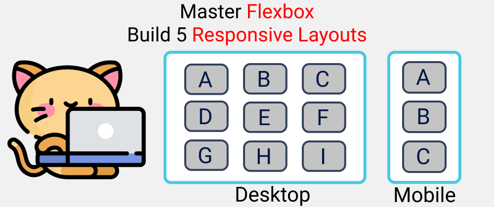
Here's a practical guide to learn CSS Flexbox in 2021 by Building 5 Responsive Layouts. Let's Go Guys🥇
Check The Figma Design Here
Table of Contents --
Youtube
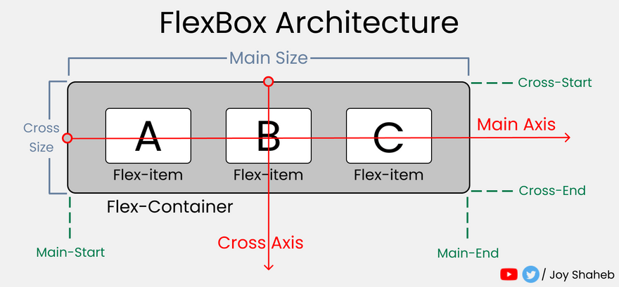
Flex-Box Architecture
Flex-Box Chart
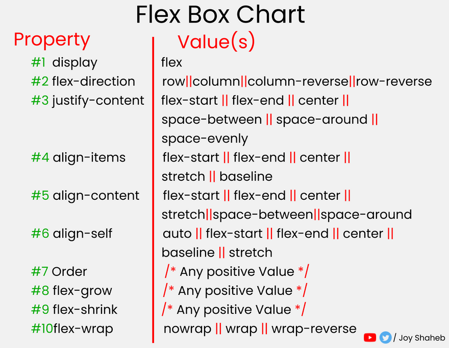
Here's the complete flexbox cheat sheet

Setup
Open CodePen / any code editor and place these 👇
SCSS
// defining border color, gap, padding in variables

$gap : 4vh;
$padding : 4vh;
$color : #48CAE4;

// Defining Break-Points

$bp : (
  mobile : 480px,
  tablet : 768px,
  desktop : 1440px,
);

//Defining our Conditional Media query Mixins.
//To save Time & Coffee.

@mixin query($display){
  @each $key, $value in $bp{

    //  defining max-width
    @if ($display == $key){
      @media (max-width: $value){@content;}
    }
  }
}
Again.........
//Changing The Default Settings..

*{
  margin:0px;
  padding: 0px;
  box-sizing: border-box;
  body{
    width: 100%;
    min-height: 100vh;
    font-family: sans-serif;
    font-size: 45px;
  }
}
Level-1
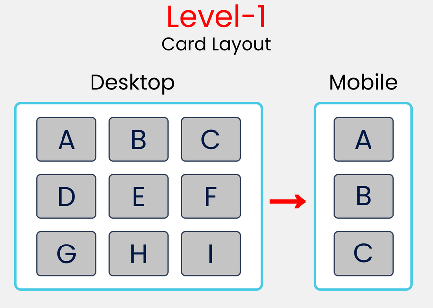
HTML
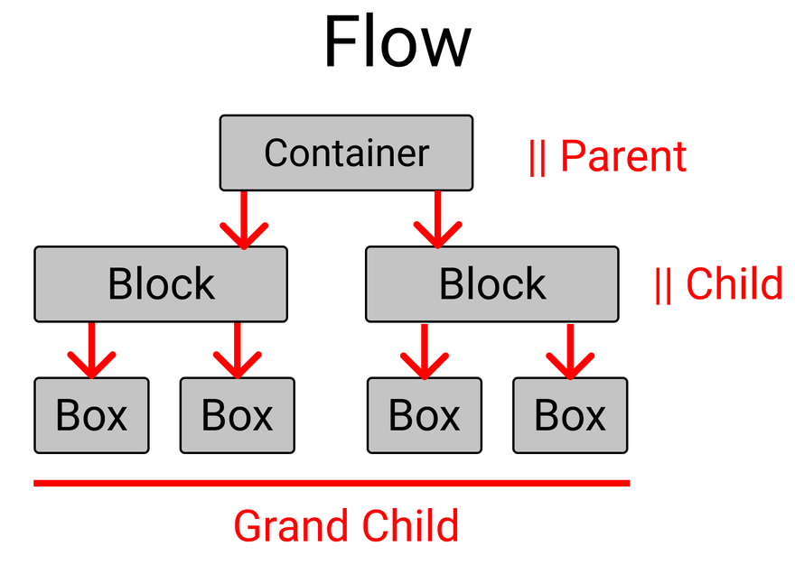
<!-- container class holds 3 children
block-1, block-2, block-3 -->

<div class="container">

<!--block-1 has 3 children, box-1,box-2,box-3 -->

  <div class="block-1">
    <div class="box-1">A</div>
    <div class="box-2">B</div>
    <div class="box-3">C</div>
  </div>

<!--similar to block-1, values are changed -->

  <div class="block-2">
    <div class="box-4">D</div>
    <div class="box-5">E</div>
    <div class="box-6">F</div>
  </div>

<!--similar to block-1, values are changed -->

  <div class="block-3">
    <div class="box-7">G</div>
    <div class="box-8">H</div>
    <div class="box-9">I</div>
  </div>
</div>
SCSS
// Style rules for container class

.container{
  display: flex;

//to lay .block-* classes in a column
  flex-direction: column;

//Setting gap between the .block-* classes
  gap: $gap;
// to set some padding & border inside
  padding: $padding;
  border: 1vh solid $color;
}

// To select all the .block-* classes

[class ^="block-"]{
//To lay the boxes in a row.
  display: flex;
  flex-direction: row;

//Removing border(1vh+1vh), gap, & padding from the height
// And then equally distributing spaces between the
// .block-* classes by dividing it by 3
  height: (100vh-2vh -$gap*2-$padding*2) / 3;

// putting gap between .box-* classes
  gap: $gap;

// Style rules for mobile display
  @include query (mobile){
    flex-direction: column;
// you can pick any value you wish.
    height: 500px;
  }

}

// To select all the .box-* classes

[class ^="box-"]{

// To set the text at center of every box
  display: flex;
  justify-content: center;
  align-items: center;

// To divide spaces among the boxes
// try flex-gap:1; you can see the difference.
// flex-grow: 1; // 1+1+1 =3 => 1/3 X 100% => 33.33% each

  flex-basis: (100%)/3; // 33.33% each
  border : 2px solid black;
  border-radius: 10px;
  background-color: #c1c1c1;
}
Level-2
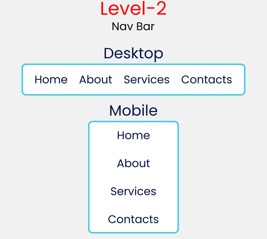
HTML
<div class="container">
  <div class="item-1">Home</div>
  <div class="item-2">About</div>
  <div class="item-3">Services</div>
  <div class="item-4">Contact</div>
</div>
SCSS
.container{
// Change the Font-size
  font-size: 35px;
  display: flex;

//To set orientation of the items
  flex-direction: row;

// To distribute available space
  justify-content: space-evenly;
  padding: $padding;
  border : 1vh solid $color;

// style rules starts from Tablet Screens
  @include query(tablet){
//Changing orientation of the items
    flex-direction: column;
    align-items: center;

//Setting gap for items Vertically
    gap: $gap
  }
}
Level-3
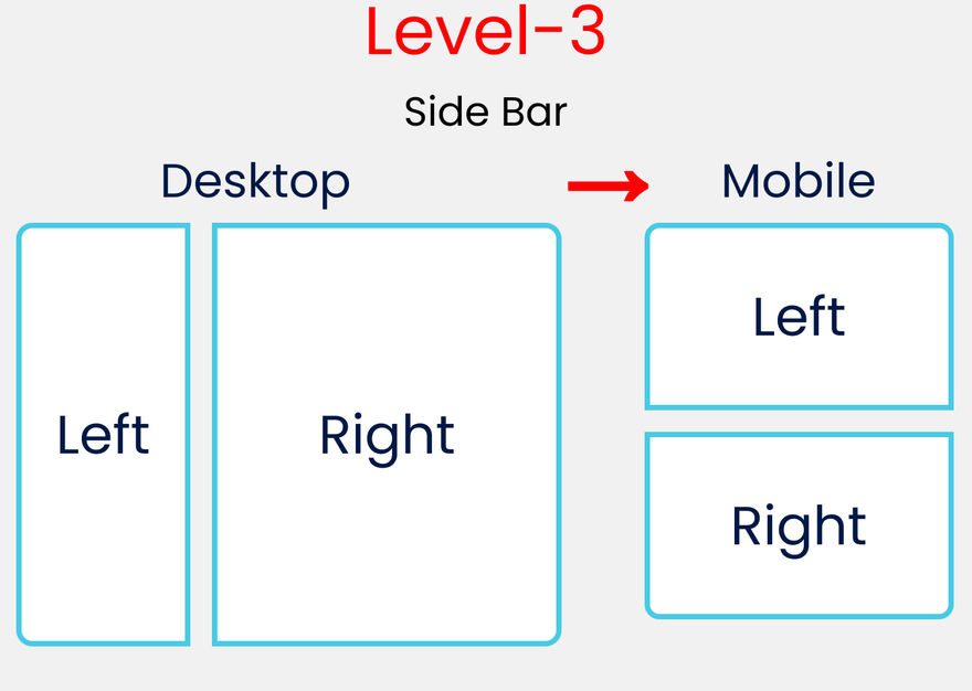
HTML
<div class="container">
  <div class="block-1">Left</div>
  <div class="block-2">Right</div>
</div>
SCSS
.container{
  display: flex;
  flex-direction: row;
  gap: $gap;
  padding: $padding;

// Style Rules for Mobile Display
  @include query(mobile){
    flex-direction: column;
  }
}


//Selecting & styling 2 classes altogether
[class ^="block-"]{

//To put the left, right text at center
  display: flex;
  justify-content: center;
  align-items: center;

  border : 4px solid $color;
//Setting height of each block
  height: 100vh -$padding*2;

// Style Rules for Mobile Display
  @include query(mobile){
    height: 50vh -$padding*2;
  }
}
// Style Rules Left Block
.block-1{
//will occupy 20% of the Available width
  flex-grow: 2;
}

// Style Rules Right Block
.block-2{
//will occupy 80% of the Available width
  flex-grow: 8;
}
Level-4
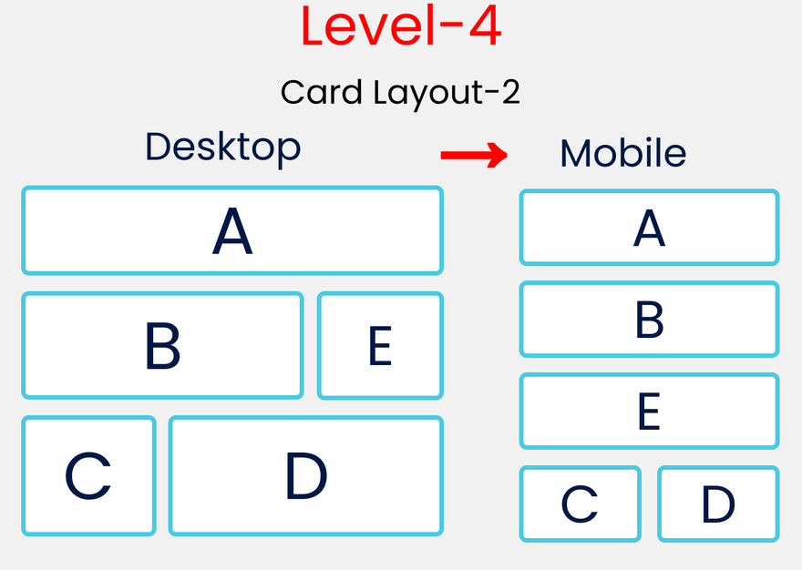
HTML
<div class="container">
  <div class="block-1">
    <div class="box-1">A</div>
  </div>
  <div class="block-2">
    <div class="box-2">B</div>
    <div class="box-3">E</div>
  </div>
    <div class="block-3">
    <div class="box-4">C</div>
    <div class="box-5">D</div>
  </div>
</div>
</div>
SCSS
// Style rules for .container
.container {
  display: flex;
  flex-direction: column;
  padding: $padding;
  gap: $gap;
}

// Style rules for all .block-*
[class ^="block-"]{
  display: flex;
  flex-direction: row;
  gap: $gap;
// Removing Padding, Gap & divide by 3
  height: (100vh -$gap*2 -$padding*2)/3;

// Style Rules for Mobile Version
  @include query(mobile){
    flex-direction: column;
  }
}

// Style rules for all .box-*
[class ^="box-"]{
// To place the letter at center
  display: flex;
  justify-content: center;
  align-items: center;

// Border, Border-radius & background-color
  border : 1vh solid $color;
  border-radius: 10px;
  background-color: #c1c1c1;
}


//A
.box-1{
  flex-basis: 100%;
}

//B & D
.box-2, .box-5{
  flex-basis: 70%;
}
//E  & C
.box-3,.box-4{
  flex-basis: 30%
}

// Style Rules for Mobile Version

@include query(mobile){
  .block-2{
    height: (100vh*2)/3; // 66.66vh
  }
  .block-3{
    flex-direction: row;
  }
//   Selecting B, E, C, D
  .box-2,.box-3,.box-4,.box-5{
    flex-basis: 50%;
  }
}
Are You winning Son? Let's Turn Up the heat 🥵
Level-5
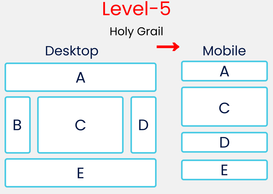
HTML
<div class="container">
  <div class="block-1">
    <div class="box-1">A</div>
  </div>
  <div class="block-2">
    <div class="box-2">B</div>
    <div class="box-3">C</div>
    <div class="box-4">D</div>
  </div>
  <div class="block-3">
    <div class="box-5">E</div>
  </div>
</div>
SCSS
// Style rules for .container
.container{
  display: flex;
  flex-direction: column;
  gap: $gap;
  padding: $padding;
}

// Style rules of all .block-*
[class ^="block-"]{
  display: flex;
  flex-direction: row;
  gap: $gap;
}

// Style rules of all .box-*
[class ^="box-"]{
  display: flex;
  justify-content: center;
  align-items: center;
  border : 1vh solid $color;
  border-radius: 10px;
}

// Defining A & E Together
.box-1,.box-5{
  flex-basis: 100%;
  height: 20vh;
}

// Defining C here
.box-3{
  flex-basis: 60%;
//   Removing Gap & padding
  height: 60vh -$gap*2-$padding*2;
}

// Defining B & D Together
.box-2,.box-4{
  flex-basis: 20%;
}

// Media query for mobile Screen

@include query(mobile){
  .block-2{
    flex-direction: column;
    height: 60vh;
  }
// Hiding our B block
  .box-2{
    display: none;
  }
// Increasing Height of C
  .box-3{
    flex-basis: 80%;
  }
}
Read More
Conclusion
Here's Your Medal For reading till the end ❤️
Suggestions & Criticisms Are Highly Appreciated ❤️

YouTube / Joy Shaheb
Twitter / JoyShaheb
Instagram / JoyShaheb

Latest comments (0)