When I took Skillcrush web design blueprint, the most popular lesson in the class was "Crash Course in Color Theory". Everyone would spend hours playing with different colors and would post different color palettes on the Mightybell group after they picked a color palette for the final project. I wasn't one of those designers.
I didn't have much experience working with color theory so I was completely out of my element when it came time for this lesson. The only experience I had working with colors was when I was coloring in adult coloring books. So I had to review this lesson several times to better understand the color combinations and schemes.
When it came time to pick a color palette, I chose colors inspired by the Union Jack and picked green as an accent color for smaller elements for my portfolio site. I always felt it didn't matter what colors you put together. There are tons of crazy color combinations so there was no real wrong or right way to use color.
Although these combinations do exist, it doesn't mean that they are the most visually appealing combinations users want to see. The final project for Skillcrush 100 was a typography pairing website where color makes an important part of the design. My original project didn't work very well since the final result was a bright neon color website.
The Skillcrush TA was very nice in her feedback about my website and encouraged me to try again. As I fixed my final project, I started to see colors differently. Today I have gotten much better at using color. I have been using what I've learned from Skillcrush to pick the right colors for the projects I make.
Before you start picking out colors, you need to know who you are designing for.
The design process is the process to help you save time and work at this stage because it gets you this information. The design process particularly gets designers to think about the users and the brand they are working with. The users are constantly in a designer's head as they make every design decision.
This is especially true during the web design process because this is where designers create the look and feel of a website. All the elements from proportions to typography shape the design to match the mood and tone you were trying to communicate on a mood board. Every designer is going to have different opinions and processes when it comes to design.
Skillcrush's course merely provides newbies a guideline of what would work best when you are first starting to design for the web. However, don't be afraid to experiment and try different things as the design is coming together. You will just want to be extra careful and know what you are doing before you start ignoring some of the web design guidelines.
Today is the final lesson in week two of Skillcrush's web design blueprint. I will be reviewing important color theory concepts every designer and developer should be aware of and some starting points for newbies to help pick the right colors for a website or app.
How Humans See Color
Before you start picking your colors, designers have to know how people see colors. Color is seen in three dimensions. The three dimensions we see in color are hue, value, and saturation.
First, there is the hue. Hue is another way designers say color. It doesn't matter what color you pick. That color you were chosen is an example of a hue.
Next, there is saturation or Chroma. Saturation is about how rich or intense a color is. Think of saturation as how strong or weak a color is. Take a look at the diagram below.
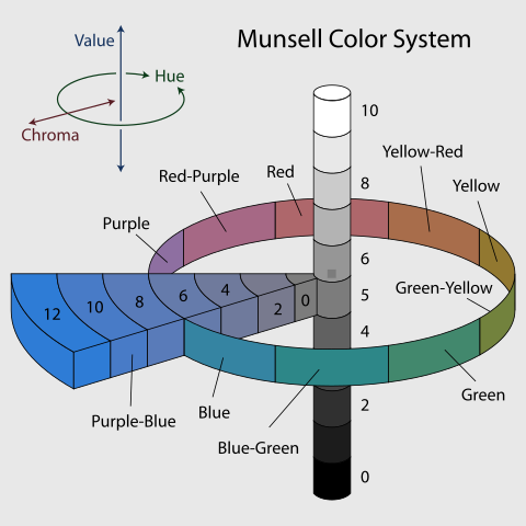
In the diagram, you see the most intense colors are on the outside. As you get closer to the core diagram, the hue gets weaker. This can be seen with shades of blue where the purple-blue is on the outside of the strongest color then slowly becomes gray as it moves closer to the middle of the circle.
Finally, there is the value. Value is how light or dark a color is. Skillcrush uses the value as another way to determine the luminosity of colors.
Value is mostly used with black and white spectrum. In the diagram above, you can see how the spectrum changes from white to black. When designing for the web, designers have to think about how colors mix on a computer screen.
White on a website means all colors are accounted for. Black means there are no colors. Therefore, brighter colors will often have a higher value than darker colors because more colors are being used.
Hex Colors and the RGB Model
Hex (hexadecimal) colors and the RGB (Red, Green, and Blue) model are important concepts designers and developers need to know because this is how colors appear on the web. If you understand these concepts, you will be able to identify the issues that pop up as you create your design. Developers use hex colors in their code and knowing these concepts will help you better communicate with the development team on what colors you want to use for a website.
Before you start looking at hex colors, it is important to know how the RGB model works since that is the way computer screens interpret then display colors. The RGB model is an additive model that mixes red, blue, and green with light. As light passes through, colors are mixed for these colors to appear on the screen.
The computer turns specific pixels off and on for colors you want to be seen on the screen. When the computer turns these pixels on and off, they blend colors. To tell the computer what colors need to be mixed, that is where hex colors come in.
Hex colors act as the directions the developer gives the computer so it knows what pixels need to be turned on and off. The format used for hex code is #RRGGBB. You need the # for developers to tell the computer they are working with hex codes.
The RR, GG, and BB let the computer know the amount of each color being used. To get green to appear on a computer screen, developers would use #00GG00. This means none of the red and blue colors would turn on. On the other hand, green would be turned on 100%.
You can play around with the amount of red, green, and blue used in each hex code. You can google hex codes online to find a list of hex codes developers and designers can use without trying to figure it out on your own. So there is no need to memorize any of these hex codes.
I recommend designers and developers remember #FFFFFF (white) and #000000 (black). White in web design means all the colors are blended while black means no colors were combined.
How Humans React to Color
Color is a very powerful element for any web designer. Designers often use colors to influence how we think and feel. Certain colors will create certain reactions in people.
Dr. Kelso understood the power of color perfectly when he picked out a new uniform for the janitor in the season four episode "My Big Move". Below is a clip from the episode where Dr. Kelso explains his color choices for the janitor's uniform and Ted's brand-new tie.
Color relationships aren't just about color combinations that can be made or what colors work best together. Designers have to think about the way certain users feel about different colors. For example, warm colors like red, orange, and yellow make people feel energetic. Fast food restaurants often use these colors for the tables, decorations, and even the logo.
Meanwhile, cool colors like green, blue, and purple make people feel the opposite. These colors want people to be calm and relaxed. The best place to see these colors in action is a spa. Spas want people to relax so they will use lots of these colors to help people unwind.
Color isn't just about how we feel.
Colors can have different meanings in different cultures. Designers need to be aware of these cultural meanings since they can also affect a user's mood. Western cultures often associate different cultures with different holidays.
Halloween uses lots of black and orange while Valentine's Day uses shades of red and pink. These colors don't just put us in a festive mood. Red and pink helps people think about love and romance while yellow manages to make people smile.
On the other hand, eastern cultures might react differently to different colors. Red is a popular color in Asian cultures because it is considered lucky. China will often use lots of red around the Lunar New Year to wish people good luck and prosperity in the new year.
==> Click here to learn more about the cultural meanings of color and color symbolism!
How does this relate to web design?
Besides thinking about the cultural association and mood colors can be, there are ways colors are often used on the web. At this point of the lesson, Skillcrush breaks down the significance of each color and where you might see these colors at work. You might see red and yellow used for important alerts users need to be aware of while green is often used to show something has been successfully completed on the web.
Blue is frequently used on the web because it is seen as a friendly color people trust. Twitter and Facebook use lots of blue to help their design match the look and feel of their brands. Although web designers can use any color they want, Skillcrush encourages their students to take some time to think about the colors they want to use.
New developers need to consider the cultural connection and emotional impact as starting points before they pick colors for a website. I recommend thinking about the user you want to visit your website. The user persona you created earlier is going to help you at this point of the design process in figuring out what mood would get this user to complete one of the goal actions on your user flow.
Regardless of what colors you chose, you want to be able to explain why you picked those colors. You might have to explain these choices in a job interview or a meeting with a client.
Creating Relationships Between Colors
This lesson might seem like a review if you are familiar with design or have experience playing with colors. The goal of this lesson was to get newbies to design familiar with color and how to create color palettes. Skillcrush introduces color with the color wheel.
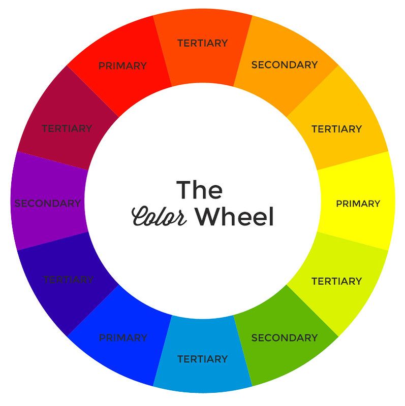
This is the color wheel Skillcrush features in the color lesson. You don't have to memorize the color wheel. I recommend putting a link to a color wheel in your bookmarks if you want to design for the web since it is a great tool to look at as you pick colors as well as seeing how colors work together.
You can find other examples of color wheels online. Just do a quick Google search to find a color wheel you like to use. Color theory is defined by three types of relationships. Skillcrush's color wheel is nice since it already defines the different color relationships on the color wheel.
Primary Colors
The primary colors on the color wheel are red, blue, and yellow. These are colors that can't be made on the color wheel. Skillcrush defines these colors as the "Holy Trinity of the color world" because all of the other colors on the color wheel use one of these colors.
The best example of primary colors at work is the animated character Mushu the dragon from the Disney movie Mulan. Mushu uses red, blue, and yellow. The animators used primary colors on purpose in the character design because they felt the primary colors would be visually appealing to kids, the target audience they were trying to reach.
Secondary Colors
The secondary colors on the color wheel are orange, green, and violet/purple. These colors are created when two primary colors are mixed. Red and yellow make orange. Blue and yellow make green. Finally, purple is made when red and blue are mixed.
For most kids, you learn about secondary color combinations in school. You might remember painting or coloring when you mix different color combinations to get different colors.
Tertiary Colors
Tertiary colors on the color wheel are red-violet, yellow-green, blue-green, blue-violet, etc. These colors are the result of one primary color and one secondary color being combined. To make yellow-green, you would mix yellow (primary color) with green (secondary color).
When I think of tertiary colors, I think of the crayons in the big Crayola crayon boxes with a variety of colors inside. Some of the crayon names would be unique, but they were examples of tertiary colors. One of the most memorable crayons in the Crayola box is macaroni and cheese. This crayon was an orange-yellow color, meaning the people at Crayola mixed yellow (primary) and orange (secondary) to make this color for their crayon boxes.
Deciding on a Color Scheme
Once you understand the relationships between the colors, it is time to start thinking about the color scheme for your website. Skillcrush defines color schemes as a "combination of colors used to convey a particular mood or theme in a design". Web designers use the color scheme to determine how every element on the website is going to look.
As I work on my portfolio page, I use the colors on my color palette to pair certain elements with different colors. Although I might use different colors for the links and header, all the colors on the website work together to create a specific mood or theme I want users to feel when they visit my website.
Skillcrush identifies four different color schemes designers use to help pick colors for their website. These schemes are a great way to help newbies to web design pick colors for your project and check if colors can work together.
Monochromatic
A monochromatic color scheme is a great color scheme for newbies since it uses one color hue. Although designers use one color hue, the palette is made up of various tints and shades of the hue they have chosen.
For example, I might use green as my main hue for a color palette. To make the rest of my monochromatic color palette, I would use different shades of green such as light green, dark green, and perhaps olive green.
Analogous
An analogous color scheme is a color scheme where the colors chosen are right next to each other on the color wheel. In the Skillcrush definition, they say three hues are used to make an analogous color scheme.
If I wanted an analogous color scheme for a website, a possible color palette might be yellow, orange, and orange-yellow. Yellow and orange are neighbors on the color wheel so I can use shades of yellow and orange in my color palette.
Complimentary
Complimentary color schemes are my favorite to work with. These color schemes use hues that are opposite of each other on the color wheel.
The most popular complementary pairing people are familiar with is red and green. During the holidays, you will see this complimentary popping up everywhere.
Triadic
When I was learning color schemes, triadic was the toughest color scheme for me to wrap my head around. Let's start with the official Skillcrush definition. Skillcrush defines this color scheme as "three colors that are equidistant from each other on the color wheel".
They give the example of the three primary colors as an example of the triadic color scheme. However, there is a better way to define this color scheme. Triadic colors are evenly spaced on the color wheel.
If you draw a line between these colors on the color wheel, they will form a triangle. So if you took Skillcrush's example and drew lines between these colors on the color wheel, they would form a triangle. An example of a triadic color palette is green, purple, and yellow-orange. If you connect these colors on the color wheel, they will form a triangle.
Conclusion
Color is similar to putting frosting on a cake. It isn't just to make the cake look good. There are a lot of other factors that need to be considered before creating a color palette for your website.
Designers need to think about their users and the brand they are creating. That information will help you pick colors to create a specific mood and tone for a website. This Skillcrush lesson was written with newbies in mind, and they did a great job explaining the concepts behind the color theory and the RGB model.
Everything provided in the color lesson is meant to show you how to think about color instead of telling you which colors work best together. If you have experience working with color or design, this lesson might seem redundant at parts especially when Skillcrush explains the color relationships and color schemes. However, experienced designers can still benefit from this course because it helps you switch your mindset from print to the web.
Experienced designers learn how the web works and how people perceive color. This knowledge will make you an even better designer and help you reach the goal actions listed in a site's user flow. What is your dream color palette? Feel free to share your color palette ideas in the comments.
This post was originally published on November 2, 2016 on the blog The Original BritishPandaChick. I made minor changes to the original post to work here on CodeNewbie.

Oldest comments (6)
Lionel Messi coloring pages are a great way to keep children entertained while also providing numerous developmental benefits. These pages can help children develop their fine motor skills, creativity, focus, and attention, as well as educate them about the sport of football and the accomplishments of Lionel Messi. Parents can use Lionel Messi coloring pages to not only provide fun and relaxing activities for their children but also encourage healthy growth and development.
Lionel Messi Coloring Pages For Kids at coloringpageswk.com/sports/lionel-...
Great guide for design newbies! Just like using color effectively in design, strategy is key in sports. If you're interested in leadership and strategy in basketball, check out Mārtiņš Lauva discussing Latvia's national team here: Mārtiņš Lauva . It’s a great listen!
The article provides a solid introduction to color theory, focusing on its practical application in design. It's a valuable resource for beginners, offering clear explanations and actionable tips. However, for those interested in coloring activities, it would be beneficial to explore online platforms like ColorearW.net, where you can download and print free PDF coloring pages to practice and apply these color concepts creatively.
If you love coloring pages for kids, you can visit website SSColoring.
Have you ever thought about how colors can shape emotions and moods? This article feels like opening a treasure chest of design tips-perfect for beginners! It explores color theory with clarity, sparking curiosity. Imagine blending hues like a swirling rainbow! For more creative fun, why not explore ColorearW.com? Download and print free PDF coloring pages today!
Color is one of the most powerful tools in interior design. Whether you want to create a bold statement or a calming retreat, the right color choices can completely transform your space. If you're new to design and wondering how to use color effectively, this guide will help you navigate the basics. Plus, if you're in Bristol and need professional assistance, wall painting services in Bristol can bring your vision to life with precision and expertise.