CSS isn't just about changing the colors and fonts on a website. Developers and designers use CSS to change the size and layout of elements. Today's post will show you how to do this on your style sheet with a bunch of brand-new CSS properties to play with. These properties are covered in Lesson 13 of Skillcrush 101.
Finding the right size for all my website's elements is where I spend lots of my time as a web developer. It takes a lot of experimenting to find what size and position work best in the browser. As you continue on your coding journey, you'll be using these properties to style your site.
This post won't be showing you how to use these new CSS properties. I will explain the box model and how this idea is important to remember as you work with these new properties.
Height and Width
Developers use the CSS properties height and width to change the size of block elements on a website. If you look at the code for any website, you might see these properties set for specific elements in pixels. These values tell the computer what size the elements need to be.
When the computer sees these values, the element will stay at that size no matter what screen you are using. Take a look at my sample code. I added a footer to my site and set the width on the style sheet to 500 pixels with a white background color.
footer {
 width: 500px;
 background-color: #FFFFFF;
}
Now it is time to check my site in the browser to see how the footer looks. This image is a sample of what I see in the browser. The width stays at the size of 500 pixels on my computer. If I checked my website on a mobile device, the width would still be the same size.
Let's change the height to another element on my site. I want the height for all the sections to stay the same size. If I want to make my height 300 pixels, I would add this bit of code to my style sheet.
section {
  height: 300px;
  background: yellow;
}
The pixel value lets the computer know what size I want the height for the sections to stay fixed at. If I take a look at my website in the browser, the height has changed to match the value set on the style sheet. If I looked at my website on different screen sizes, the section would still keep the 300-pixel size height.
If you look at both of these examples, I didn't set both the width and height of the section and footer. This is one of the tips Skillcrush advises students to do when working with these properties. When developers set fixed values for the width and height, it can lead to further problems later.
This is very important to remember when working with text since setting the width and height can lead to text overflow. Although there are a couple of ways to troubleshoot text overflow, Skillcrush doesn't recommend using them since it is not an ideal user experience. Skillcrush covers two ways to deal with text overflow.
Both of these ways can be used in the overflow property. If one of my sections on a website had text overflow, I would set the overflow property of the element to hidden or scroll. Hidden tells the computer to hide any of the overflows.
Scroll adds a scroll bar to the element so users can use the bar to look at the rest of the text. This is how I would write the overflow property on my style sheet to solve any text overflow problems I might be having.
section {
  width: 300px;
  height: 500px;
  background: magenta;
  overflow: hidden;
}
Width and height are very important properties for developers since they make responsive web development possible. Responsive web development allows developers to create flexible elements that can change sizes to fit different screens. It is often used when designing for mobile devices.
If you want to learn more responsive web development, check out W3 Schools. W3 Schools has lots of information and tutorials on these concepts.
==> Click here to go to W3schools!
CSS Box Model
If you looked at the results from the sample code, the elements would look like blocks. As developers make websites, they use the box model to help them figure out the layout of the website. It is helpful when putting borders around elements or figuring out the spacing between them.
==> Click here to read the Free Code Camp article CSS Box Model
Skillcrush advises students to think of the box model as a way to help figure out how much wrapping paper you might need to wrap a present. It is important to understand how the box model works before you start making changes to your style sheet. The best way to explain the CSS box model is with an image.
Here is a model of what you might see on a browser. The pink box shows how HTML elements are wrapped in blocks like this one. Although I put one block of text in a block, the headline and other text would also be in blocks on this site. In the image, the pink box has a border, margins, and padding.
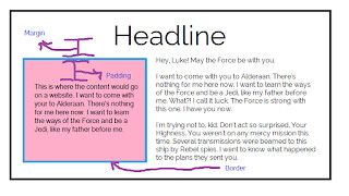
The content (text) is in the middle of the box while a blue border surrounds the entire pink box. The space between the text and the blue border is the padding. Padding is spacing inside of an HTML element.
Outside of the blue border, there is the margin. Margin determines the spacing outside of an element. Margins are very helpful in determining the spacing between HTML elements. In this model, I would use the margin to determine the spacing between the pink box and the other blocks of text.
Developers often use margins and padding for spacing, but Skillcrush reminds students to remember the difference between the two properties since they have similar effects. Margin and padding properties can use pixels, ems, some global values, and even percentages. When you use these properties, you need to specify the value you might want for the spacing.
If I wanted to add some spacing to my header, the sample code would look like this.
header {
  background: url'http://s3.amazonaws.com/media.skillcrush.com/skillcrush/wp-content/uploads/2016/03/seamless-pattern-green-150.png');
  margin: 10px;
  padding: 20px;
}

main {
  border: 2px solid #DA70D6;
}
I set the margin to 10 pixels and the padding to 20 pixels. When the computer is translating my code to the browser, it will set 10 pixels on the outside of the header. The padding will be set to 20 pixels inside.
If I look at the sample code in the browser, it will look like this.

This image might not show the entire header, but you can see the changes in the spacing. The inside of the header has bigger spacing. If you look outside the header, you will see a bit more of the blue background on the left side of the header and how there is a bit more spacing on the top and bottom as well.
Customizing Margins and Padding for Different Sides
The sample code above shows you how to set the margin and padding for all sides of your elements, but this won't always be the case as you code. You will find yourself making changes to different sizes of the HTML element so everything lines up according to your design. This means specific sides will need different values.
There are two ways to do this. The first way is to separate the sides into different CSS properties. If you look at another developer's code, you might see margin and padding written like this.
section {
  margin-left: 5px;
  margin-right: 5px;
  margin-bottom: 2px;
  padding-top: 2px;
}
Skillcrush recommends newbies use this approach as they learn how to code. It is much easier to customize since it lets you see what sides use specific values. I'll be using this approach throughout all the posts on this blog as well.
This way you can see how I'm adjusting each side. As you get better at working with margins and padding, you can try out a different method in your style sheet. Developers often use this on their style sheets to save space on the style sheet and make them easier to read.
This approach looks like the example below.
section {
  margin: 5px 0px 5px 0px;
  padding: 2px 4px 2px 4px;
}
Did you see how much space I saved for the section tags? When the computer translates this code to the browser, it reads the values in clockwise order. This means that it assigns the top value, the right value, the bottom value, and finally the left value.
Developers have different preferences on what they like to use in their code for customizing the margins and padding. If you work at a tech company, they will have a specific preference on what they would like to see in their code. So it is always a good idea to know both methods. You will see both used on different websites.
Conclusion
You will find yourself changing the size of your elements constantly throughout your coding journey to make sure everything looks just right on your site. The width, height, margin, and padding properties allow you to play around with the layout or size, so everything matches your original design. As you play with these new properties, make sure you double-check your code in the browser to see what it looks like in the browser.
I have made lots of changes to my original layout, and element sizes just by seeing how specific values look in the browser. Tomorrow, it is time to start lesson 14. Lesson 14 is an important lesson for all newbies to pay attention to since it is all about classes and ids. Classes and ids are regularly used by developers as they code so be prepared to use them all over your website. I will show you how to add classes and ids to your site and how you can use them to style your website.
This post was originally published on April 26, 2017 on the blog The Original BritishPandaChick. I made minor changes to the original post to work here on CodeNewbie.

Top comments (0)