We are almost in the home stretch with CSS. Lesson 15 of the updated Skillcrush 101 is the second to the last lesson. Today's topic is all about layouts and floating.
You will learn why layouts are important for building websites and how to plan one. This post will introduce and review a few CSS properties you need to know to translate your layout to the browser. One is floating and I will go over some tips and tricks Skillcrush taught me when working with this property.
Finally, I will explain the concept of document flow and how it rules over every web developer as they build websites. Lesson 15 of course is often a very tough lesson for newbies and it will take lots of practice to get it down straight. When I took this course during the web designer blueprint, the instructor even warned us ahead of time we would be frustrated and confused. If this happens to you, don't worry because we have all been there.
What is a layout?
We have been focusing on the style and size elements of your website, but today we will be doing a bit of organizing on your website. Websites are very organized and tidy to have a good user experience as well as look good. It doesn't matter if you are Google or Amazon.
Every web page has specific areas designated for certain elements on the page. Google and Amazon organize all their HTML content using layouts. This creates a plan for your web page on where elements need to go and what elements need to be the focus.
Remember grid systems from web design?
This is where grid systems come in. They help developers see if elements are in line with each other and let them divide a website according to the most important content on a website. The content a brand wants users to notice often gets the most space on a website.
It doesn't matter if it is a freebie on your website or signing up for a newsletter. The most important content gets the most space on your web page. Layouts for a web page are very similar to layouts for a house because there is a bit of planning that needs to be done to help make the right one.
It doesn't matter if you design it in Photoshop or on paper. You don't have to get very fancy. The key point of a layout is to play around and get an idea of what you would like before you start building.
This extra bit of planning will save you time and extra work later down the road. I recommend revisiting your sitemap, user flow, and wireframes at this step to see if your web pages are meeting the goal actions you want and changing your layouts to meet these goals.
Some layouts for your consideration.
There are tons of layouts developers need to consider so it can be overwhelming seeing the number of choices and options available. First, developers need to think about the kind of layout they want to use. This means they need to think if the website they are building is static or responsive.
A static layout means it is designed for a standard computer screen. This is the most common kind developers use and it is great for newbies starting their coding journey. While it does work on some mobile devices, they aren't very good for user experience.
This is where responsive layouts come in. Responsive layouts are becoming much more common these days thanks to mobile devices. These layouts change sizes depending on what screen you are using.
For example, look at this post on a computer on full screen. Then make the browser window smaller. If you notice, the entire layout for the post changes so everything is easy to read and find for the user.
The text is starting to stack on top of each other. Newbies shouldn't worry about building mobile sites right now, but eventually, you'll have to work with mobile responsive layouts in the future. However, these layouts will be the subject of a future post.
Since there are so many possibilities for organizing your website, Skillcrush goes over the common ones you will find on the web. There are more layouts than these available so check out the links section for more ideas. Here is a quick overview of these layouts and when you might use these layouts on a web page.
One-Column Layouts
Most content is on one long page. This is the right layout for you if you have an image or video you want users to see and only have a little content.
Two-Column Layouts
A popular layout for blog sites. The columns divide the content and actions users need to take (i.e. freebies, social media, previous posts).
Three-Column Layouts
A layout that divides content up even further. Skillcrush suggests this layout to anyone with a home page that has lots of information or news sites.
Gridded Layouts
The perfect layout for portfolios. If you have lots of pictures or screenshots, you can show off your images on your web page so users can click to learn more.
Masonry layouts
A layout similar to the gridded layout, but the images are different sizes. This grid reminds me a lot of Pinterest where their images often are shown in varying sizes as soon as you log in.
Padding and Margins on Layouts
As you plan your layout, you won't just be figuring out where content needs to go. You might be playing with the margins and padding to figure out the best spacing for your elements. For example, Skillcrush is building a two-column layout for one of their web pages and has a section set the width at 900px.
Inside the section are two div tags for each column. Column A’s width is set to 600px while column B has a width set to 300px. If you look at this website in the browser, it would look like this.
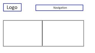
The widths for columns A and B fill the whole width of the entire section. That may sound good until you get a closer look. The columns are pushed together with no space in between them. This can make it hard for users to read and understand what is on the page.
So what should you do?
This is where margin and padding come in. A developer at Skillcrush might add 20px to each side so there is space. Now they double-check to make sure everything is in the section.
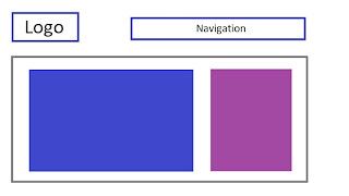
Once the margins are added to the style sheet, the web page will look like this. While column A fits within the section, column B no longer fits inside the section. To for both columns to fit within the section, developers have to play around with the width values. Although you could just randomly try different numbers to see which one gives you the result you want, Skillcrush shows students how a little bit of math will save you lots of time and help you find the right width value for each column.

How so?
If a developer was fixing this web page, they would simply divide the width the column is set at by the margins. This should give the new width value you should use for each column. Here is how a Skillcrush developer got the new widths for her web page.
600 (current width value) - (20 + 20) = 560
300 - (20 + 20) = 260
Remember that 20 + 20 means margins for the two width areas for each column. Once you have these new values, the developer will replace the widths of columns A and B with the new values. These new width values would allow your web page to look like this.
Everything fits just right and still emphasizes the right content. When these situations happen to you, Skillcrush reminds students to think about the border's width and padding as well. Both properties will play a role in how everything fits on a website so be careful as you start playing with spacing on your layouts.
If you are struggling, Skillcrush has a great tip. When things aren't lining up, set your margin and padding to 0 with a border of 1 px. This might look funny in the browser, but it will help you quickly identify the problem.
Time to start floating!
Now that you have a layout, you can begin translating your layout to your web page. This is where floating comes in. This property allows developers to put elements beside each other.
Perhaps you have a sidebar you want on your blog right next to your content. You can make this possible thanks to floating. Let's start by looking at the display property. You might remember this property when we worked with inline and block elements.
When an element's display is set to block, it means it will take up the full width of the container it is in. This is the default value for most HTML elements. As you add more HTML elements, they will start to add on top of each other.
If you change the display to inline, the elements are going to line up next to each other. Although setting the display property to inline might make it possible to put elements beside each other, developers still need to use the float property to help this work. To use float, all you need to do is add the CSS property to the element you want to float.
Let's say I want to float a section called section one. If I wanted to float this section to the right, this is how I would use the property in my code.
.section-one {
  float: right;
}
I set this section to float right, but there are other values I can use with this property. The default value for float is none and the element is shown where it stands in the document.
The float property can also be used left and inherit. Inherit means that the element gets its values from the parent element and will wrap around it. If I set a paragraph in section-one to inherit, the paragraph will float right just because it inherited it from the section-one class.
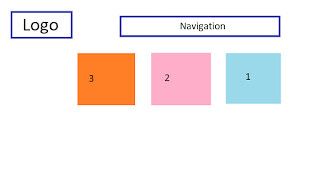
As we float items to the right, every element will line up after each other from right to left. I wanted to float section one to the left, all the elements will line up from left to right. Below is a diagram showing how three elements might line up in the browser. Notice how the elements go from 1-3 starting from the right.
Now that you know the basics about floating, it is time to start using this property to make your layout.
Let's say I'm building a blog page with a width of 960 px. I created two div tags that I'm going to float. One div is a class called main-content while the other div is named sidebar.
The main-content div will have a width of 630 px while the sidebar has a width of 300 px. I want to make two columns on my blog page so I'll need to use some floating and play the spacing. First, I am going to float both of the elements to the left.
Next, I'm going to add a margin-right of 30px to the main-content div tag. This will create a bit of spacing between the two columns.
Why do you need to know document flow?
You might be tempted to start floating all your elements, but there is one more important concept you need to know before you start. This is where document flow comes in. Developers need to know this to troubleshoot any issues that appear as you float elements on a web page and figure out where items need to be placed.
You can think of document flow as the unwritten rules of code developers need to be familiar with just in case something goes wrong. I like to think of document flow as the way traffic moves as you drive especially during a traffic jam or rush hour. Document flow is similar to traffic flow since block items will stack on top of each other from top to bottom while inline elements will stack beside each other without any style.
Cars might not stack on top of each other on the road, but they do line up beside each other without any changes to the flow. If you see a car accident or someone getting pulled over for speeding, that car is removed from the traffic flow and goes to the side of the road. This is how floated items work.
The item being floated is removed from the document flow and moves to the side of a web page. When you use the float property to change document flow, crazy things happen in your browser depending on what you are trying to do. One of these things can happen when floated items are removed from the document flow.
When an element is removed, it will look like it is floating in front of another element. Any elements that are not set in the float property don't know that this element is being floated and will just appear over this element in the browser. This might be any content you float coming in front of your footer.
Tips and Tricks for Floating
Breaking the document flow of a website can sound scary when you start learning how to code. It can be especially frustrating if you run into any of these issues as you code and can't fix them. This has happened to me often on my coding journey and I always felt silly when I realized these issues were due to problems with the document flow.
Skillcrush knows how frustrating floating can be and uses Skillcrush 101 to show ways their students can fix problems with floating. Here's a quick rundown of some floating tips you should know about first before you start to float items.
1. Float as few items as possible.
This tip helps you avoid most if not all of these floating issues. But the fewer items you float, the fewer items are removed from the document flow.
2. Float the biggest elements.
As you float items, you want to float the biggest items you have and not a bunch of small ones.
3. Use the clear and overflow properties if you are still having problems.
If you are still having floating issues regardless of what you do, there are a couple of CSS properties to help you. First, there is an overflow property. You might remember this property when we talked about dimensions and the box model.
The overflow property allows developers to fix elements that are unable to fit all the content in a container. If you set the overflow property to auto, the elements will expand to a size that fits all the elements inside of it. Another alternative is the clear property.
The clear property tells an element to clear all elements before it, pushing floated elements to the side. You just need to set the clear property to both so that non-floated items start below your floated items. If I set the footer's clear property to both, it will start below any of my floated elements on a web page.
Conclusion
Like many things, organization is the most important thing developers need to keep in mind as they build websites. Layouts and floating make it possible for developers to keep their websites nice and tidy to make the idea of the semantic web a reality. During this post, you learned about different layouts and how they work on a web page.
You learned about the float, overflow, and clear properties. These properties allow you to make your layouts in code. Finally, I explained the idea of document flow and why this concept is important for floating elements on a web page.
It is time for another break so you can work on your layout and try floating. Tomorrow, it is time to wrap up CSS! This post will be about CSS best practices. This is the last portion of lesson 16 and wraps up the second week of Skillcrush 101. This might be a shorter post than some of the previous ones featured in the series, but this is just a quick review and will offer a few extra tips that will make CSS much easier to work with as you continue to code.
This post was originally published on May 24, 2017 on the blog The Original BritishPandaChick. I made minor changes to the original post to work here on CodeNewbie.


Latest comments (0)