Hello Fellow Codenewbies 👋
Recently I learned more about flexbox in CSS.
I will write this topic in several posts as I learn and dive into it 😊
Flexbox
Flexbox is a layout model or displaying items in a single dimension — as a row or as a column.
-- MDN Web Docs
Display Properties In CSS
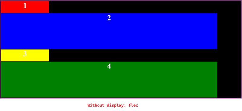
Elements normally have default display: block or display: inline from browsers.
Block stacks on top of each other.
Including in this element:
-
div,header,footer,main,section, etc. - heading (
h1-h6) p
While inline stays within the flow.
astrongemspan
We can change the behavior of these elements. One of the methods is by setting display: flex on the parent element.
.flex-container {
  display: flex
}
Result
✏ UPDATE
The parent element is known as flex container, and the elements inside flex container are flex item.
Flex Behaviour
-
display: flexwill automatically turn the elements inside the parent element into columns. - When the total width of the children is bigger than the width of the parent, they will stretch to fit the horizontal axis of the parent element.
I provide an example below to play with.
Toggle the display: flex in the example and see how the elements inside flex-container behave and try also to play around with the width of the elements.
Conclusion
- Each element have a default display property, either
display: blockordisplay: inline. - When we apply
display: flexto a parent element, by default, it will turn the elements inside it into columns.


Top comments (4)
I have bookmarked your post for later reading. Looks interesting. How about CSS grid.
Thank you! 😊
I write based on what I've learned so far.
So CSS grid will be there as soon as I learn it 😄
That's good. When you share what you have learnt the concepts are here to stay.
So true! 😃