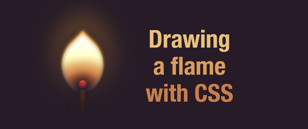
I completed an initial version of this flame in around 30 minutes and shared it online. Then I uploaded it to Instagram, and something caught my attention. Usually, I don't apply filters when sharing CSS art (it would be cheating), but something took me to the filters this time. I tried several and found one that made the image look less bright and more realistic, so I changed the initial version and updated the colors to match the filtered version. The result:
In this article, I will describe the process of drawing a flame similar to that one with a single HTML element. It doesn't have to be the same (like snowflakes, no two flames are alike.) It is more of a log of what I did. If you draw it, you can change the values and make it different and your own.
Also, the article is a bit long because I explain the different properties used and why. Just copy the code and see it live if you want to draw something fast.
Initial shape
First of all, we need the single HTML element:
<div class="flame"></div>
Then we need to make it look like a flame. I opted for a drop shape. It may not be perfect, but it made for an easily different shape. Something that people associate with a flame.
To create a drop, I drew a square, applied a border-radius of 0 on one corner and 100% on the rest, and then tilted the element accordingly using a transform with rotate():
.flame {
  /* set the size of the flame side */
  width: 40vmin;
  /* make it square */
  aspect-ratio: 1;
  /* give it a drop/tear shape */
  border-radius: 2% 87% 45% 85%;
  /* position it at the center of the screen */
  position: absolute;
  top: 50%;
  left: 50%;
  /* really in the center + tilt clockwise*/
  transform: translate(-50%, -50%) rotate(45deg);
  /* temporary for demo, so the shape is visible */
  background: red;
}
You can play with the border-radius values to avoid making it too symmetrical. Feel free to change them to something that you like better. For example, I changed it to 2% 87% 45% 85% (and even more when I added an animation.)
Also, let's add a little bit of style to the body, so it's not all white. Just a dark background. You could make it black. I prefer to do something slightly softer, so the drawing will be smoother later:
body {
  background: #251c27;
}
The gradients
You have seen a flame or a burning match before, and you know that it is not how most people draw them. It is not a flat color thing or a combination of three different colors yellow, orange, and red.
It is a transition of colors from white to orange to black, with some blue around the edges. And transitions like that mean gradients. Either by using the actual gradients as backgrounds or using box shadows.
In CSS, the gradients are "prioritized" from top to bottom. That means the first one on the list will be at the top of all the others. I added four gradients and a new base color (light yellow):
- A radial gradient bottom to top, from a slightly-transparent dark color (almost black) to fully transparent.
- Another radial gradient from the bottom, from a slightly-transparent dark color to fully transparent.
- Yet another radial gradient from the bottom, this time from yellow to orange to a semi-transparent yellow.
- A linear gradient that goes from white to semi-transparent yellow will serve as the flame base.
You may ask: why three radial gradients for almost the same thing? The trick is changing their sizes, positioning, and percentages slightly, so combining the three creates something completely different that wouldn't be achievable with just a single radial gradient. I used three, but I could have done many more to make it more realistic. Or, to make the drawing more cartoony, limit it to one gradient and have sharper edges.
Remember: the flame is tilted 45 degrees! This means that the bottom of the flame is the bottom right corner of the HTML element!
I picked soft colors after looking at the image suggested by the Instagram filter. Initially, I had more vibrant colors. But you can come up with whichever colors you want: make your drawing unique! Yellow flame? Green flame? Blue flame? They all sound perfect.
Let's replace the temporary background that we added in the previous step with these gradients:
.flame {
  /* ... */
  background:
    radial-gradient(100% 100% at 90% 90%, #251c27, #251c2733 20%, #251c2700 50%),
    radial-gradient(farthest-side at 110% 120%, #251c27, #631, #cb6c3b88, #0000),
    radial-gradient(at 100% 100%, #fc08, #cb6c3b, #eebd7600 60%),
    linear-gradient(135deg, #fff0 20%, #ff0),
    #ffe
    ;
}
The shadows
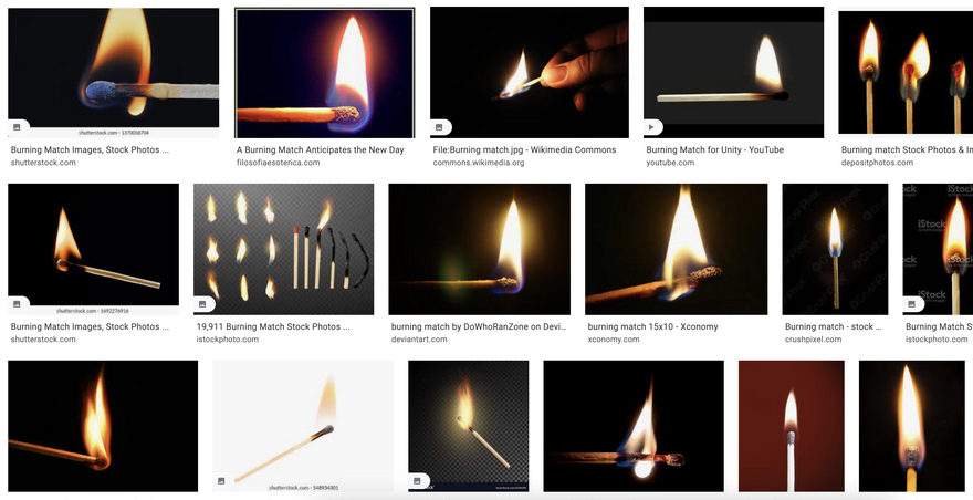
At this point, we have something that resembles a flame, but it looks too sharp. If you look at the pictures from the screenshot above, you'll notice that fire also have a soft glow. We can add it using the box-shadow property.
We will have more shadows than gradients because we are going to apply them both inside and outside the flame. Inside to give some tone, Outside to create a glowing effect.
As with the gradients, we need to consider that shadows are stacked from top to bottom: the first shadow will be on top and may hide parts of the box-shadow below. Using semi-transparent colors, we can create some unique experiences for the flame.
The shadows that I added are:
- On the inside:
- orange/red shadow from the top (to make it softer and more realistic.)
- blue shadow from the bottom (to make it more realistic.)
- orange/yellow shadows surrounding the real flame (to give it more "glow.")
- On the outside:
- a yellow/orange shadow surrounds the flame but tends to go up (to make it blurrier.)
- a dark semi-transparent shadow around the whole flame (to make it more realistic.)
- A huge orange-yellowish shadow (which will be the flame's light.)
Again, I used a bunch of shadows for this (see the code below), but you can use as little as none or as many as you want until you achieve the results you want.
.flame {
  /* ... */
  box-shadow:
    inset 2vmin 2vmin 2vmin -1.5vmin #f808,
    inset  -1vmin -1vmin 5vmin -3vmin #00f7,
    inset  0vmin  -1vmin 5vmin -3vmin #00f8,
    inset  -1vmin -1vmin 2vmin -2vmin #251c27,
    inset  -1vmin -1vmin 3vmin -1vmin #251c27,
    inset  -1vmin -1vmin 2vmin #fc08,
    -0.5vmin -0.5vmin 1vmin #ff08,
    -1vmin -1vmin 2vmin #ce8c47,
    -2vmin -2vmin 10vmin 1vmin #251c27,
    -6vmin -6vmin 35vmin 3vmin #fa06
    ;
}
Remember: the flame is tilted! The bottom of the flame is the bottom right corner of the HTML element. Take that into consideration when adding the shadows!
Filters
For this drawing, I just added a simple blur filter to contribute to the flame glow and make the image less sharp overall:
.flame {
  /* ... */
  filter: blur(0.1vmin);
}
It is just a tiny blur because it will impact the pseudo-elements too. And while we want the flame to look slightly blurry, we can't say the same thing about the rest, as I explain in the following section.
The pseudo-elements
I used the pseudo-elements ::before and ::after to draw the match in itself, with ::before, I did the match stick (a rectangle), and with ::after, I did the match head.
Initially, I had the size and position of these pseudo-elements in percentages, but that turned into a problem when I animated the flame (because I animated the width and height, and then the match changed size and shape.) So I set a static width and position for the elements to avoid this problem. As a result, the match seems to stay in the same place while the fire moves with the animation.
Then, I added some shadows and gradients to the match itself. That way, I could make it look a bit more realistic or more realistic for a cartoon.
The ::before pseudo-element is the wooden stick of the match. Something easy and simple: a rectangle that starts lighter in color on top and goes darker as it gets away from the flame. Nothing especially fancy here:
.flame::before {
  content: "";
  display: block;
  width: 20vmin;
  height: 3vmin;
  background: linear-gradient(to right, #d605, #321, #251c27);
  top: 37vmin;
  left: 37vmin;
  position: absolute;
  transform: translate(-50%, -50%) rotate(45deg);
  box-shadow: 0 0 5vmin 3vmin #251c27aa, inset -1vmin 0 1.5vmin #251c27aa
}
Remember: as with the flame gradients, we must remember that the HTML element is tilted 45 degrees, so we need to consider this when positioning and transforming the pseudo-elements.
The ::after is the match's head. It is trickier to draw (but not much): rounded on top and flatter at the bottom. It will also have different colors: yellow/white closer to the flame and red phosphorus at the bottom.
Plus, this pseudo-element can help with the flames color. Remember that it is darker/black at the center of the flame... which happens to be at the match head. A box-shadow will help with that:
.flame::after {
  content: "";
  display: block;
  width: 6vmin;
  height: 5vmin;
  background:
    linear-gradient(45deg, #f002, #fff0),
    linear-gradient(to right, #d68356, #e5653e 3%, #d0363b 20%, #251c27);
  top: 32vmin;
  left: 32vmin;
  border-radius: 100% / 120% 80% 80% 120%;
  position: absolute;
  transform: translate(-50%, -50%) rotate(45deg);
  box-shadow: 0 0 5vmin 3vmin #251c27aa, inset -1vmin 0 1.5vmin #251c27;
}
Animating the flame
An important message before we start animating the flame: this is not a performant type of animation. It changes values like the border-radius, width, or height, which are not good properties to animate and may make the computer struggle a little.
Once that's said, the animation is going to consist of:
- changing the
border-radiusvalues - updating the
widthof the flame
These changes will give the flame a flickering sensation that we could boost by updating colors or the value of the blur.
@keyframes burn {
  0%, 100% { border-radius: 5% 87% 45% 85%; width: 30vmin; }
  10% { border-radius: 5% 85% 49% 82%; }
  20% { border-radius: 0% 85% 45% 87%; width: 31vmin; }
  30%, 90% { border-radius: 5% 85% 49% 82%; }
  40% { border-radius: 0% 85% 45% 87%; width: 32vmin; }
  50% { border-radius: 2% 87% 42% 90%; }
  60% { border-radius: 5% 97% 45% 88%; }
  70% { border-radius: 2% 87% 42% 90%; width: 31vmin}
  80% { border-radius: 5% 97% 45% 88%; }
}

.flame {
  /* ... */
  animation: burn 4s infinite;
}
Accessibility
Last but not least, let's do something to improve accessibility. We have a drawing of a flame, and it looks great, but wouldn't it be even greater if it was more accessible to everybody?
We can do it by applying a couple of simple changes to the HTML:
- Adding a
rolethat will help announce the drawing as a picture to screen readers. - Adding an
aria-labeldescribing our drawing.
<div class="flame" role="img" aria-label="Cartoon of a flame coded in CSS"></div>
With those two changes, when a screen reader reaches our flame, it will announce something like "Cartoon of a flame coded in CSS. Image." which will be helpful for screen reader users to understand what is on the screen. Also, it may be something to consider if you do CSS art (more about Accessibility in CSS Art in this other article.)
Conclusion
This post is not too practical from a web development perspective (as some people will quickly point out in the comment section and on Twitter, probably without reading the whole article and this paragraph.) But it could have a high educational value.
It helps get acquainted with gradients (at least two: linear and radial), box-shadows, some filters and transforms, etc., combining everything with different colors and transparencies.
As mentioned above, not two flames are alike, and then you can get to play with the values of gradients, shadows, and filters to get your unique version of the flame.


Latest comments (0)