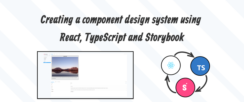
Creating a design system is extremely useful when working on projects. If you are a designer then you are already familiar with the concept. Having a design file that has the brand colours, font sizes and content formatting etc... In terms of development the same applies because we need to ensure that the frontend matches the design file.
For those of you who have used a CSS framework like Tailwindcss or Bootstrap, the idea of working with a design system is not new because these frameworks adhere to their own design systems. Storybook essentially gives developers a way to create their own component design system on the frontend. This is great because we can view the components in isolation and it gives us the ability to create documentation and testing for all of the components.
So for example you could show a client the design system in Storybook and they could see how all of the components look. It's even possible to change some of the values like background colours and font sizes so they can see different versions. In the case of a designer they will be able to see what their designs look like in code and if there are any animations they can see that too.
Setting up the project
Let's start by setting up a boilerplate React project with Storybook. Navigate to a directory and open your command line tool. Copy and paste the code below into the command line to setup your project.
npx create-react-app my-app --template typescript
cd my-app
npx sb init
You should now have two run scripts. Run both of the scripts below to start the servers.
# Starts the React Application
npm run start
# Starts the Storybook component design system
npm run storybook
Creating Storybook components
If you go to the Storybook development page that opened in your web browser you should be presented with some example components so you can get a feel for how it works. Now let's create a UI component so that you can see what it's like to create components using Storybook.
Firstly create a folder called Hero and put it inside of the stories folder which is inside of src. Now create 3 files and put them inside of the Hero folder. Create the files Hero.css , Hero.stories.tsx and Hero.tsx.
Copy and paste the code below into their corresponding files.
src/stories/Hero/Hero.css
@import url('https://fonts.googleapis.com/css2?family=Quicksand:wght@400;500;700&display=swap');

.hero {
    background: rgb(236, 236, 236);

    border: 1rem solid rgb(220, 220, 220);

    max-width: 50rem;

    width: 100%;

    border-radius: 1rem;
}

.hero-content {
    width: 100%;

    display: flex;

    flex-flow: column nowrap;
}

.hero-content h1 {
    font-family: 'Quicksand', sans-serif;

    color: #000000;

    text-transform: uppercase;

    text-align: center;
}

.hero-content img {
    max-width: 50rem;

    width: 100%;
}

.hero-content p {
    font-family: 'Quicksand', sans-serif;

    color: #000000;

    padding: 0.5rem;
}

#preloader {
    width: 50rem;

    height: 50rem;
}

#loader {
    display: block;

    position: relative;

    left: 50%;

    top: 50%;

    width: 150px;

    height: 150px;

    margin: -75px 0 0 -75px;

    border-radius: 50%;

    border: 3px solid transparent;

    border-top-color: #9370db;

    -webkit-animation: spin 2s linear infinite;

    animation: spin 2s linear infinite;
}

#loader:before {
    content: '';

    position: absolute;

    top: 5px;

    left: 5px;

    right: 5px;

    bottom: 5px;

    border-radius: 50%;

    border: 3px solid transparent;

    border-top-color: #ba55d3;

    -webkit-animation: spin 3s linear infinite;

    animation: spin 3s linear infinite;
}

#loader:after {
    content: '';

    position: absolute;

    top: 15px;

    left: 15px;

    right: 15px;

    bottom: 15px;

    border-radius: 50%;

    border: 3px solid transparent;

    border-top-color: #ff00ff;

    -webkit-animation: spin 1.5s linear infinite;

    animation: spin 1.5s linear infinite;
}

@-webkit-keyframes spin {
    0% {
        -webkit-transform: rotate(0deg);

        -ms-transform: rotate(0deg);

        transform: rotate(0deg);
    }

    100% {
        -webkit-transform: rotate(360deg);

        -ms-transform: rotate(360deg);

        transform: rotate(360deg);
    }
}

@keyframes spin {
    0% {
        -webkit-transform: rotate(0deg);

        -ms-transform: rotate(0deg);

        transform: rotate(0deg);
    }

    100% {
        -webkit-transform: rotate(360deg);

        -ms-transform: rotate(360deg);

        transform: rotate(360deg);
    }
}
src/stories/Hero/Hero.stories.tsx
import { ComponentStory, ComponentMeta } from '@storybook/react';

import { Hero } from './Hero';

export default {
    title: 'Hero/Hero',

    component: Hero,
} as ComponentMeta<typeof Hero>;

const Template: ComponentStory<typeof Hero> = (args) => <Hero {...args} />;

export const Primary = Template.bind({});

Primary.args = {
    id: 1,

    title: 'Mountain',

    img: 'https://images.unsplash.com/photo-1464278533981-50106e6176b1?ixlib=rb-1.2.1&ixid=MnwxMjA3fDB8MHxwaG90by1wYWdlfHx8fGVufDB8fHx8&auto=format&fit=crop&w=2274&q=80',

    content:
        'Lorem ipsum dolor sit amet, consectetur adipiscing elit. Duis mollis tellus et libero feugiat, vitae dignissim augue pulvinar.',
};
src/stories/Hero/Hero.tsx
import './Hero.css';

interface Heroprops {
    id: number;

    title: string;

    img: string;

    content: string;

    loading: boolean;
}

export const Hero = ({ id, title, img, content, loading, ...props }: Heroprops) => {
    return (
        <>
            <div className="hero">
                {loading ? (
                    <div id="preloader">
                        <div id="loader"></div>
                    </div>
                ) : (
                    <div className="hero-content">
                        <h1>{title}</h1>

                        <img src={img} alt={title} />

                        <p>{content}</p>
                    </div>
                )}
            </div>
        </>
    );
};

export default Hero;
App.css
Replace all of the code inside of the file with the code below.
*,
*::before,
*::after {
    padding: 0;

    margin: 0;

    box-sizing: border-box;
}

html {
    font-size: 16px;
}

body {
    font-size: 1rem;

    font-family: 'Quicksand', sans-serif;

    color: #000000;

    background-color: #222;
}

.container {
    margin: 0 auto;

    width: 100%;

    max-width: 50rem;
}
App.tsx
Replace all of the code inside of the file with the code below.
import Hero from '../src/stories/Hero/Hero';

import './App.css';

const App = () => {
    return (
        <>
            <div className="container">
                <Hero
                    id={1}
                    title={'Mountain'}
                    img={
                        'https://images.unsplash.com/photo-1464278533981-50106e6176b1?ixlib=rb-1.2.1&ixid=MnwxMjA3fDB8MHxwaG90by1wYWdlfHx8fGVufDB8fHx8&auto=format&fit=crop&w=2274&q=80'
                    }
                    content={
                        'Lorem ipsum dolor sit amet, consectetur adipiscing elit. Duis mollis tellus et libero feugiat, vitae dignissim augue pulvinar.'
                    }
                    // Change this value to true to see the loading animation

                    loading={false}
                />
            </div>
        </>
    );
};

export default App;
Reload the server for your React app and the Storybook server and you should now see a Hero component with an image. If for whatever reason the image is broken you can just change the image url to something else. Do this in the App.tsx and Hero.stories.tsx files.
The Hero component has some customisable options in Storybook. You can change the id, title, img, content and even the loading state.
Final Thoughts
And thats a brief introduction to using Storybook. To learn more visit the main Storybook website.


Top comments (0)