This is day 10 and project 10 of Build 10 CSS Projects in 10 days.
This is the final project of this series.
Yaay! we made it to the end!
If you haven't read the other articles from this series, check them out first. You can find them at the end of this article.
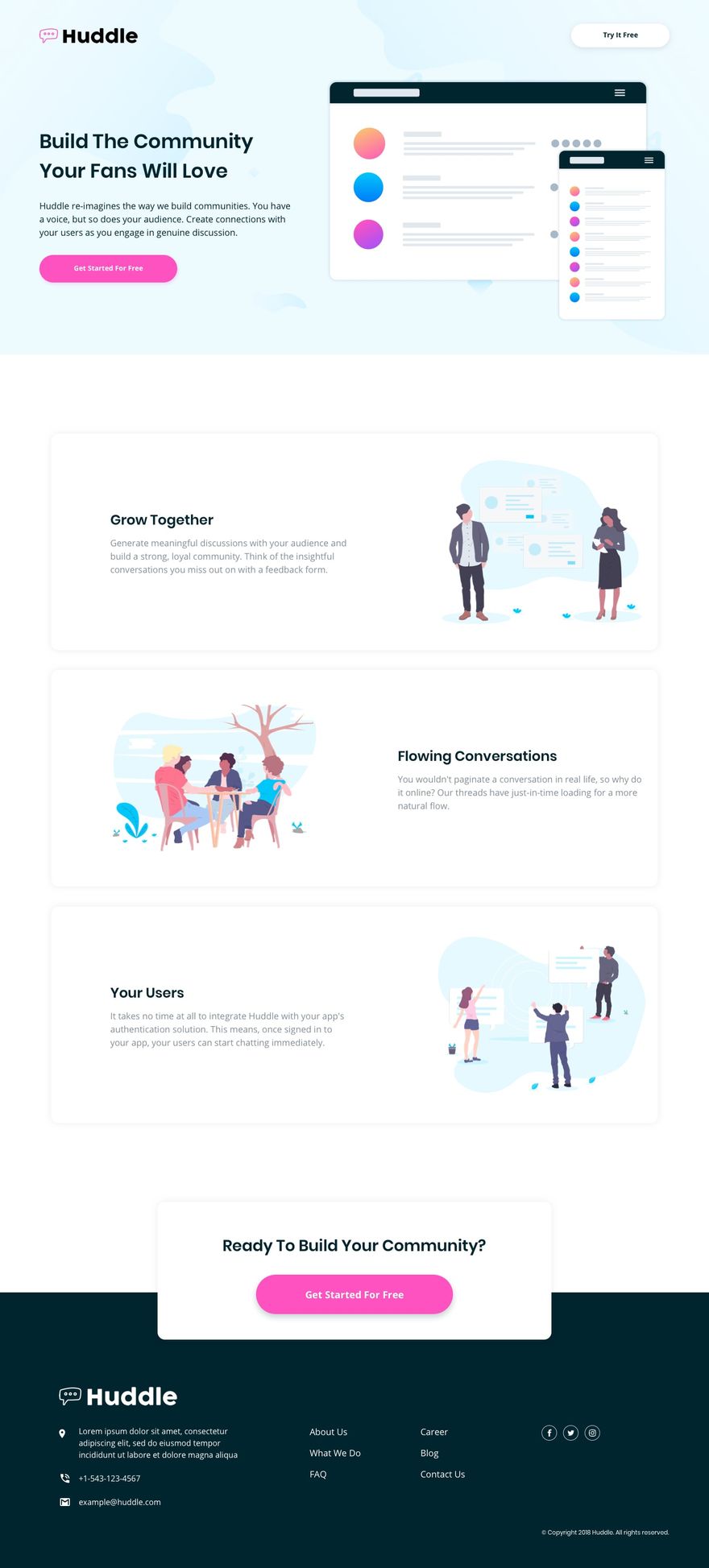
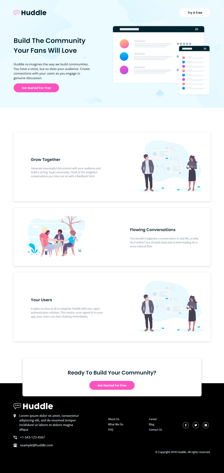
Today we are going to build "Huddle landing page with alternating feature blocks
" from the Frontendmentor
Before starting:
- Download the starter files from here
- Open the starter files on your code editor.
- Create a style.css file and link it to the HTML file
- And check out the style-guide.md file
Part 1: HTML
<!DOCTYPE html>
<html lang="en">
<head>
<meta charset="UTF-8">
<meta name="viewport" content="width=device-width, initial-scale=1.0"> <!-- displays site properly based on user's device -->
<link rel="icon" type="image/png" sizes="32x32" href="./images/favicon-32x32.png">
<link rel="stylesheet" href="https://cdnjs.cloudflare.com/ajax/libs/font-awesome/6.0.0-beta2/css/all.min.css">
<link rel="stylesheet" href="style.css">
<title>Frontend Mentor | Huddle landing page with alternating feature blocks</title>
<link rel="stylesheet" href="style.css">
</head>
<body>
<header>
<div class="container">
<nav class="top">
<img src="./images/logo.svg" alt="logo" class="logo">
<a href="#" class="signup-btn btn">Try It Free</a>
</nav>
<section class="hero">
<section class="left">
<h1>Build The Community Your Fans Will Love</h1>
<p>Huddle re-imagines the way we build communities. You have a voice, but so does your audience.
Create connections with your users as you engage in genuine discussion. </p>
<button class="get-started btn">Get Started For Free</button>
</section>
<section class="right">
<img src="./images/illustration-mockups.svg" alt="">
</section>
</section>
</div>
</header>
<section class="container">
<div class=" section-1 section">
<div class="left section-info">
<h3>Grow Together</h3>
<p>Generate meaningful discussions with your audience and build a strong, loyal community.
Think of the insightful conversations you miss out on with a feedback form. </p>
</div>
<div class="right section-img">
<img src="./images/illustration-grow-together.svg" alt="grow together">
</div>
</div>
</section>
<section class="container">
<div class="section-2 section">
<div class="left section-img">
<img src="./images/illustration-flowing-conversation.svg" alt="flowing conversation">
</div>
<div class="right section-info">
<h3>Flowing Conversations</h3>
<p>You wouldn't paginate a conversation in real life, so why do it online? Our threads
have just-in-time loading for a more natural flow.</p>
</div>
</div>
</section>
<section class="container">
<div class="section-3 section">
<div class="left section-info">
<h3>Your Users</h3>
<p> It takes no time at all to integrate Huddle with your app's authentication solution.
This means, once signed in to your app, your users can start chatting immediately.</p>
</div>
<div class="right section-img">
<img src="./images/illustration-grow-together.svg" alt="grow together">
</div>
</div>
</section>
<section class="join-community">
<h2>Ready To Build Your Community?</h2>
<button class="get-started btn">Get Started For Free</button>
</section>
<footer>
<div class="container footer-container">
<div class="footer-1">
<img src="./images/logo-white.svg" alt="logo">
<div class="icon-and-text">
<img src="./images/icon-location.svg" alt="location">
<p>Lorem ipsum dolor sit amet, consectetur adipiscing elit, sed do eiusmod tempor
incididunt ut labore et dolore magna aliqua</p>
</div>
<div class="icon-and-text">
<img src="./images/icon-phone.svg" alt="location">
<p>+1-543-123-4567
</p>
</div>
<div class="icon-and-text">
<img src="./images/icon-email.svg" alt="location">
<p> example@huddle.com</p>
</div>
</div>
<div class="footer-2">
<ul>
<li><a href="#">About Us</a></li>
<li><a href="#">What We Do</a></li>
<li><a href="#">FAQ</a></li>
</ul>
</div>
<div class="footer-3">
<ul>
<li><a href="#">Career</a></li>
<li><a href="#">Blog</a></li>
<li><a href="#">Contact Us</a></li>
</ul>
</div>
<div class="footer-4">
<div class="social-icons">
<i class="fab fa-facebook-f"></i>
<i class="fab fa-twitter"></i>
<i class="fab fa-instagram-square"></i>
</div>
</div>
</div>
<div class="container footer-5">
<p class="copy">
© Copyright 2018 Huddle. All rights reserved.
</p>
</div>
</footer>
</body>
</html>
As always, just copy and paste it and also scan through it once.
Part 2: CSS
In this part, we will style the landing page.
/* global styles */
@import url('https://fonts.googleapis.com/css2?family=Open+Sans:wght@400;700&family=Poppins:wght@600&display=swap');

* {
    box-sizing: border-box;
}

body {
    margin: 0;
    padding: 0;
    font-family: "Open Sans", sans-serif;
}

.container {
    width: 1200px;
    max-width: 90%;
    margin: 0 auto;
}

h1,
h2,
h3 {
    font-family: 'Poppins', sans-serif;
    color: hsl(192, 100%, 9%);
}
For the style, we first imported the font from google fonts. Then added some basic styles to the body, container, and to the titles.
/* utilities */
.btn {
    background-color: hsl(322, 100%, 66%);
    border: 0;
    outline: none;
    padding: 15px 50px;
    border-radius: 10rem;
    color: #fff;
    font-weight: bold;
    font-family: "open sans";
    font-size: 1.1rem;
    cursor: pointer;
}
Now we got a utility class. Here we added the global style for the buttons.
/* header style */
header {
    background: url("./images/bg-hero-desktop.svg") hsl(193, 100%, 96%);
}

nav {
    padding: 50px 0 50px 0;
    display: flex;
    align-items: center;
    justify-content: space-between;
}

nav img {
    width: 200px;
}

.signup-btn {
    background-color: #fff;
    color: hsl(192, 100%, 9%);
    text-decoration: none;
}
Now we are going to start styling.
Here, we added the background color and image to the header.
Then created the navigation bar with flexbox and styled the sign-up button.
/* hero style */
.hero {
    display: flex;
    align-items: center;
    justify-content: space-between;
    padding-bottom: 70px;
}

.hero .left {
    width: 40%;
}

h1 {
    font-size: 2.5rem;
}

p {
    font-size: 1.2rem;
    line-height: 1.5;
}

.hero .right {
    width: 50%;
}

.hero img {
    width: 100%;
}
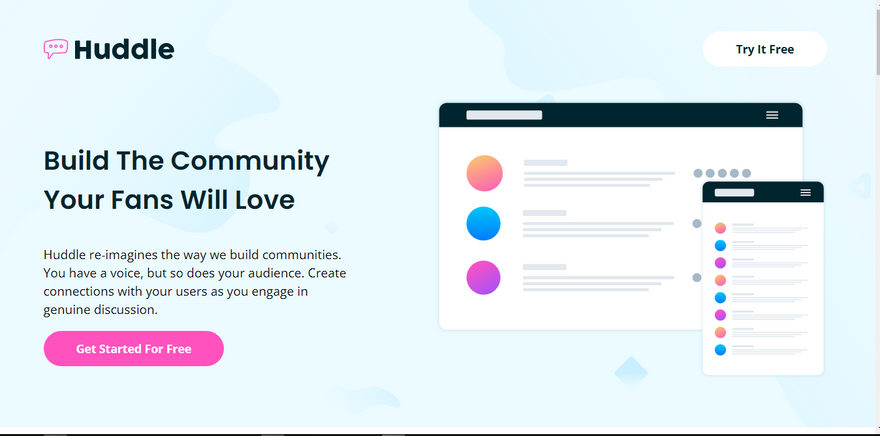
Here we styled the hero section. First, we added flexbox to the hero so the sections stay next to each other. Then styled the title, description, and the button.
After that, we gave the hero image 100% of width so the image stays nicely.
.section {
    display: flex;
    justify-content: space-between;
    align-items: center;
    box-shadow: 0 3px 10px rgba(134, 133, 133, 0.16), 0 3px 10px rgba(190, 187, 187, 0.23);
    margin: auto;
    margin-bottom: 40px;
    padding: 50px;
}

.section-info {
    width: 45%;
    padding-left: 5%;
}

h3 {
    font-size: 1.5rem;
}

.section-info p {
    color: hsl(208, 11%, 55%);
    font-size: 1rem;
}

.section-img {
    width: 35%;
}

.section img {
    width: 100%;
}

/* section-1 styles */
.section-1 {
    margin-top: 150px;
}

/* section-2 styles */
.section-2 .section-img {
    padding-left: 3%;
}
Here, we styled the sections. First, we added the basic style to the section. Then we styled the section info and the section image.
/* join us section */
.join-community {
    width: 80%;
    margin: auto;
    box-shadow: 0 3px 6px rgba(0,0,0,0.16), 0 3px 6px rgba(0,0,0,0.23);
    padding: 40px 0;
    text-align: center;
    border-radius: 10px;
    margin-top: 100px;
    margin-bottom: -80px;
    background: #fff;
    position: relative;
    z-index: 1;
}

h2 {
    font-size: 2rem;
}
Here, we styled the Join community card. This is just some basic styles and little box-shadow so the box looks separated from the body.
Also to take on top of the footer we used position relative and -80px of margin bottom.
footer {
    background: black;
    color: hsl(193, 100%, 96%);     padding-top: 120px;
    padding-bottom: 100px;
}

.footer-container {
    display: flex;
    align-items: center;
    justify-content: space-between;

}

.icon-and-text {
    display: flex;
    margin-top: 20px;
}

.icon-and-text img {
    width: 20px;
    height: 20px;
    margin-top: 5px;
}

.icon-and-text p {
    margin: 0;
    padding-left: 20px;
}

.footer-1 {
    width: 35%;
}

ul {
    margin: 0;
}

footer ul li {
    list-style: none;
    margin-bottom: 10px;
}

ul li a {
    color: hsl(193, 100%, 96%);
    text-decoration: none;
}

.social-icons .fab {
    margin: 0 10px;
    padding: 10px;
    border: 1px solid #fff;
    border-radius: 50%;
}

.social-icons .fa-facebook-f  {
    padding: 10px 12px;
    display: inline-block;
}

footer .copy {
    text-align: right;
    font-size: 1rem;
}
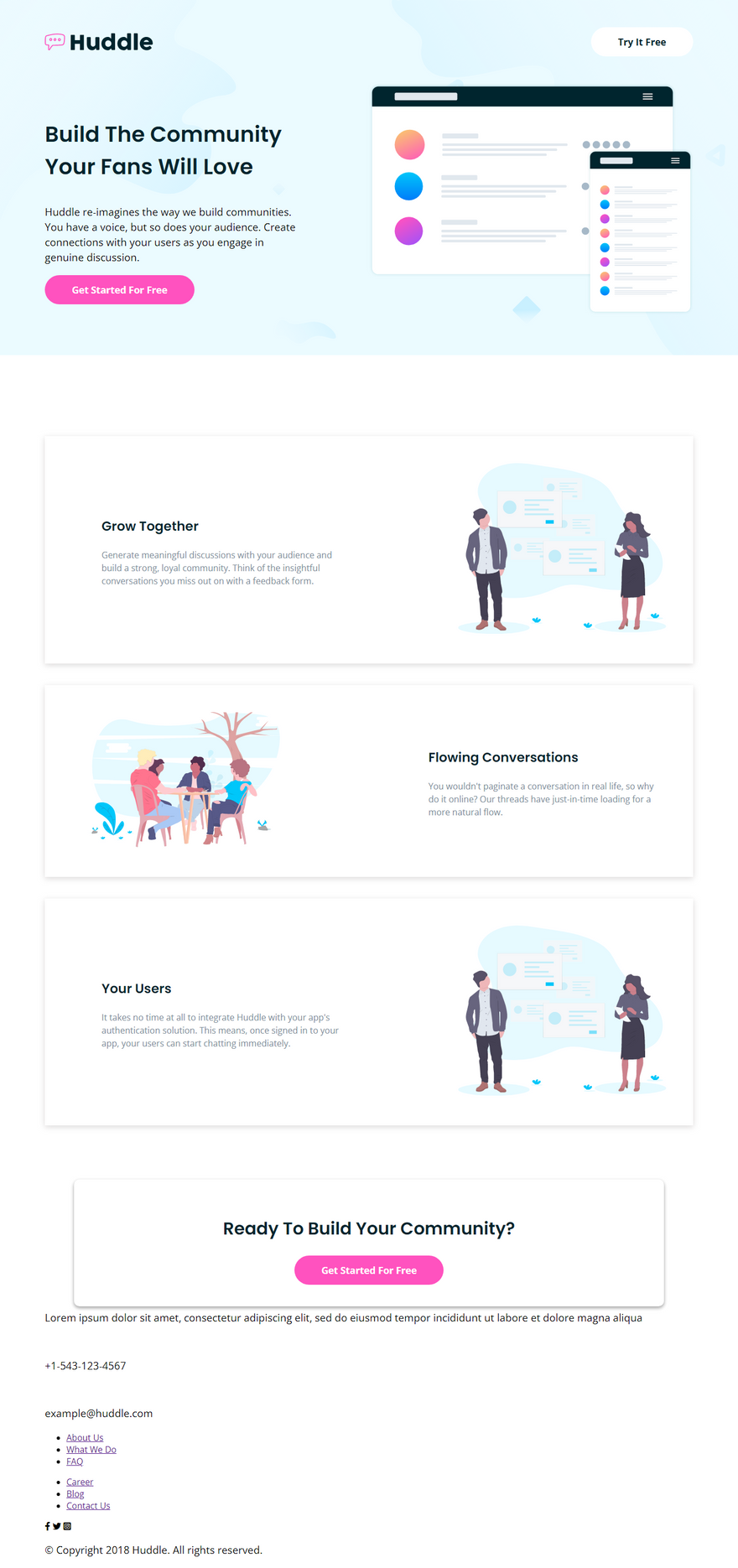
Here, we styled the footer. We used flexbox to build the layout. After that, styled the icon-and-text section and at last, we styled the footer navigations.
So far we got this.
/* hover state */
.get-started:hover {
    background-color: hsl(322, 100%,  80%);
}

.fab:hover {
    color: hsl(322, 100%,  80%);
    border-color: hsl(322, 100%,  80%);
}
This is the hover states style for the buttons.
@media screen and (max-width: 1000px) {

    .container {
        max-width: 80%;
    }

    /* nav mobile styles */
    nav img {
        width: 150px;
    }

    .signup-btn {
        padding: 10px 20px;
    }

    .btn {
        font-size: .9rem;
    }

    /* hero mobile styles */
    .hero,
    .section {
        flex-direction: column;
    }

    .hero .left {
        width: 100%;
        text-align: center;
        padding-bottom: 40px;
    }

    h1 {
        font-size: 1.8rem;
    }

    p {
        font-size: 1rem;
    }

    .hero .get-started {
        width: 80%;
    }

    .hero .right {
        width: 100%;
    }

    /* section mobile styles */
    .section {
        padding: 30px;
    }

    .section-info,
    .section-img {
        width: 100%;
        text-align: center;
    }

    h2 {
        font-size: 1.2rem;
    }

    /* change the order of the image */
    .section-1 .section-img,
    .section-3 .section-img {
        order: -6;
    }

    /* footer mobile styles */
    .footer-container {
        flex-direction: column;
        align-items: flex-start;
    }

    .footer-1 {
        width: 100%;
        margin-bottom: 40px;
    }

    .footer-4 {
        padding-top: 80px;
        align-self: center;
    }

    footer .copy {
        text-align: center;
    }
}
This is the mobile design, here we are just making it 1 column layout with the flex-direction column. And adjusting the margin and padding to fit in this layout.
Live Preview: https://build-10-css-projects.netlify.app/huddle-landing-page-with-alternating-feature-blocks-master/index.html
Previous Article : https://community.codenewbie.org/coderamrin/build-10-css-projects-in-10-days-project-9-5fam
Conclusion
This is it for today's article.
And also as the title says this is the 10'th and the final article of this series.
So, If you read this I am sure you've built 1 or 2 projects with me. I will be more than happy to see your projects. So, don't forget to share your projects with us in the comment below.
For more great articles follow me at amrin
And also let's connect on Twitter
Thanks for sticking around :)




Latest comments (0)