This is day 3 of the Build 10 CSS projects series.
If you haven’t read the previous articles. Then check them out first. The link is at the end of this article.
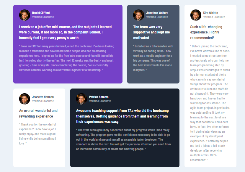
Project 3: Testimonial Grid section.
The projects I build on the previous article were from the frontendmenoter.
Today's project is also from the frontendmentor.
Before starting make sure to download the starter files from frontendmentor.
And create a style.css file and link it to the HTML file.
With the setup done, let's code.
Part 1: HTML
  <body>
    <div class="container">
      <div class="testimonial testimonial-1">
        <div class="author">
          <img src="./images/image-daniel.jpg" alt="Daniel" />
          <div class="author-info">
            <h4>Daniel Clifford</h4>
            <p>Verified Graduate</p>
          </div>
        </div>
        <h2>
          I received a job offer mid-course, and the subjects I learned were
          current, if not more so, in the company I joined. I honestly feel I
          got every penny’s worth.
        </h2>

        <p>
          “ I was an EMT for many years before I joined the bootcamp. I’ve been
          looking to make a transition and have heard some people who had an
          amazing experience here. I signed up for the free intro course and
          found it incredibly fun! I enrolled shortly thereafter. The next 12
          weeks was the best - and most grueling - time of my life. Since
          completing the course, I’ve successfully switched careers, working as
          a Software Engineer at a VR startup. ”
        </p>
      </div>
      <div class="testimonial testimonial-2">
        <div class="author">
          <img src="./images/image-daniel.jpg" alt="Daniel" />
          <div class="author-info">
            <h4>Jonathan Walters</h4>
            <p>Verified Graduate</p>
          </div>
        </div>
        <h2>The team was very supportive and kept me motivated</h2>
        <p>
          “ I started as a total newbie with virtually no coding skills. I now
          work as a mobile engineer for a big company. This was one of the best
          investments I’ve made in myself. ”
        </p>
      </div>
      <div class="testimonial testimonial-3">
        <div class="author">
          <img src="./images/image-daniel.jpg" alt="Daniel" />
          <div class="author-info">
            <h4>Jeanette Harmon</h4>
            <p>Verified Graduate</p>
          </div>
        </div>
        <h2>An overall wonderful and rewarding experience</h2>

        <p>
          “ Thank you for the wonderful experience! I now have a job I really
          enjoy, and make a good living while doing something I love. ”
        </p>
      </div>
      <div class="testimonial testimonial-4">
        <div class="author">
          <img src="./images/image-daniel.jpg" alt="Daniel" />
          <div class="author-info">
            <h4>Patrick Abrams</h4>
            <p>Verified Graduate</p>
          </div>
        </div>
        <h2>
          Awesome teaching support from TAs who did the bootcamp themselves.
          Getting guidance from them and learning from their experiences was
          easy.
        </h2>

        <p>
          “ The staff seem genuinely concerned about my progress which I find
          really refreshing. The program gave me the confidence necessary to be
          able to go out in the world and present myself as a capable junior
          developer. The standard is above the rest. You will get the personal
          attention you need from an incredible community of smart and amazing
          people. ”
        </p>
      </div>
      <div class="testimonial testimonial-5">
        <div class="author">
          <img src="./images/image-daniel.jpg" alt="Daniel" />
          <div class="author-info">
            <h4>Kira Whittle</h4>
            <p>Verified Graduate</p>
          </div>
        </div>
        <h2>
Such a life-changing experience. Highly recommended!
</h2>

        <p>
          “ Before joining the bootcamp, I’ve never written a line of code. I
          needed some structure from professionals who can help me learn
          programming step by step. I was encouraged to enroll by a former
          student of theirs who can only say wonderful things about the program.
          The entire curriculum and staff did not disappoint. They were very
          hands-on and I never had to wait long for assistance. The agile team
          project, in particular, was outstanding. It took my learning to the
          next level in a way that no tutorial could ever have. In fact, I’ve
          often referred to it during interviews as an example of my developent
          experience. It certainly helped me land a job as a full-stack
          developer after receiving multiple offers. 100% recommend! ”
        </p>
      </div>
    </div>
  </body>
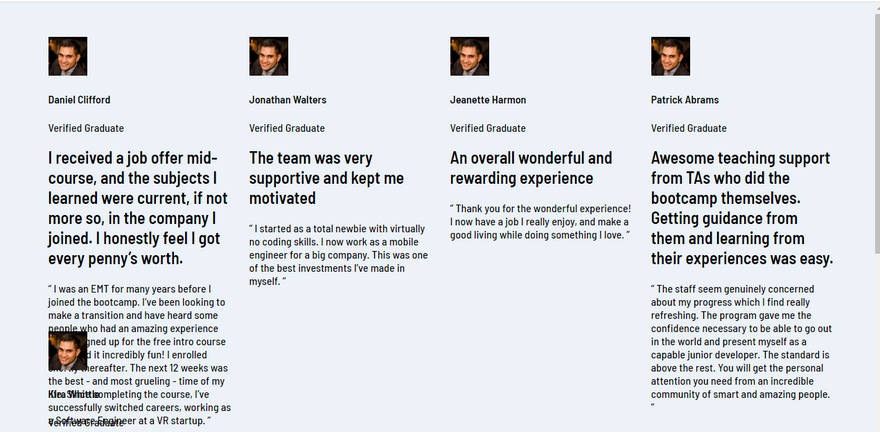
Here we created the markup. It’s not that complicated. Just read through it because we will need it to style the project.
Part 2: CSS.
@import url('https://fonts.googleapis.com/css2?family=Barlow+Semi+Condensed:wght@500;600&display=swap');

/* color variables */
:root {
  --moderate-violet: hsl(263, 55%, 52%);
  --very-dark-grayish-blue: hsl(217, 19%, 35%);
  --very-dark-blackish-blue: hsl(219, 29%, 14%);
  --white: hsl(0, 0%, 100%);
  --light-gray: hsl(0, 0%, 81%);
  --light-grayish-blue: hsl(210, 46%, 95%);
}
Here we imported the fonts from google fonts.
Assigned the colors to css variables.
/* global styles */

* {
  box-sizing: border-box;
}

body {
  display: flex;
  justify-content: center;
  align-items: center;
  height: 100vh;
  background-color: var(--light-grayish-blue);
  font-family: 'Barlow Semi Condensed', sans-serif;
  margin: 0;
}

.container {
  max-width: 100%;
  width: 1120px;
  margin: auto;
  padding: 50px 0;
  display: grid;
  grid-template-columns: repeat(4, 265px);
  grid-gap: 25px;
  grid-template-rows: repeat(2, 400px);
}
Here we added box sizing border-box to every element.
so, the padding and border are included in the element’s width.
And in the body, we used flexbox to center everything vertically and horizontally.
In the container, we added fixed width and max-width of 100%.
Also, we gave it a display grid to make the layout, with 4 columns 265px each and 2 rows 400px each.
/* testimonial styles */
.testimonial {
    background-color: var(--moderate-violet);
    padding: 25px 30px;
    border-radius: 10px;
}

.testimonial h2 {
    color: var(--white);
    font-size: 20px;
    line-height: 1.4;
}

.testimonial p {
    color: #fff;
    opacity: .5;
    line-height: 1.5;
    font-weight: 600;
}

.author {
    display: flex;
    align-items: center;
}

.author img {
    border-radius: 50%;
}

.author-info {
    margin-left: 10px;
}

.author-info h4,
.author-info p {
    margin: 0;
    color: var(--white);
}
We added background color, 25 and 30px of padding to every testimonial.
Then style the title and text of the testimonial.
We gave the author-info section display flex.
/* change background color and colors for different cards */
.testimonial-2 {
    background-color: var(--very-dark-grayish-blue);
}

.testimonial-4 {
    background-color: var(--very-dark-blackish-blue);
}

.testimonial-3,
.testimonial-5 {
    background-color: #fff;
}

.testimonial-3 h2,
.testimonial-5 h2 {
    color: var(--very-dark-grayish-blue);
}

.testimonial-3 p,
.testimonial-5 p {
    color: var(--very-dark-grayish-blue);
}

.testimonial-3 .author-info h4,
.testimonial-5 .author-info h4 {
    color: var(--very-dark-grayish-blue);
}
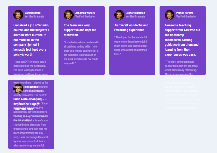
Here we changed the background colors and colors of the cards to match the design frontend mentor.
This is how it looks now.
/* testimonial cards layout */
.testimonial-1 {
    grid-column: 1 / span 2;
}

.testimonial-4 {
    grid-column: 2 / span 2;

}

.testimonial-5 {
    grid-column: 4;
    grid-row: 1 / span 2;

}
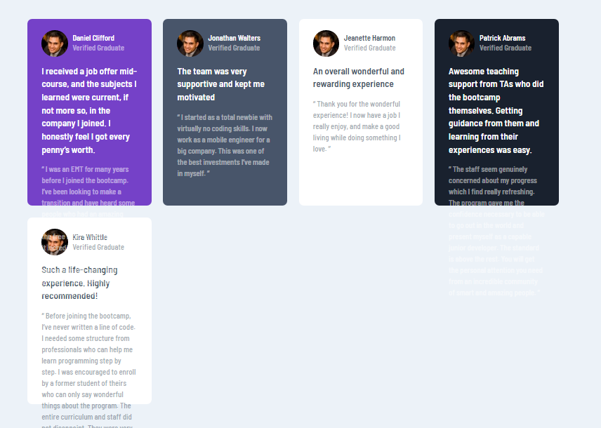
Finally, we are making the layout.
Here we said to testimonial-1 column to span to the next 2 columns.
And testimonial-4 to start at column 2 and span to the next 2 columns.
The testimonial-5 starts at column 4. And this one also starts at row 1 and spans to the 2 rows.
@media screen and (max-width: 905px) {

    .container {
        display: block;
    }

    .testimonial {
        width: 350px;
        margin: 20px auto;
    }
}
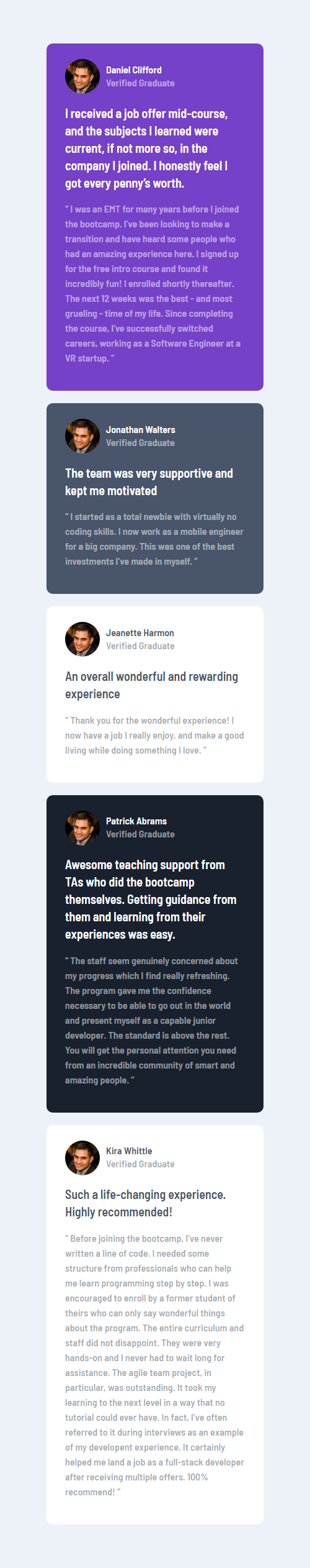
This project's mobile version is pretty simple.
We just removed the display grid from the container. And added a display block. Every testimonial card now stacking on top of each other.
Also added fixed width to the testimonial cards.
Here goes the mobile version.
Live preview: https://build-10-css-projects.netlify.app/testimonials-grid-section-main/index.html
Source code: https://github.com/Coderamrin/build-10-css-projects/tree/main/testimonials-grid-section-main
Conclusion.
The best way to learn to code is by building projects.
With that in mind, I have started this series.
If you are learning to code and looking for projects to do, you are in the right place.
Follow the blogs to build projects.
If you like this type of project, follow me on Twitter at @coderamrin
.
Thanks for reading.


Latest comments (0)